The revamped SNS Salon & Beauty Supply website
A complete redesign of SNS Salon's website that better speaks to their expertise with compelling storytelling and fixes major usability issues by restructuring information architecture and page layouts.

My Role
UI/UX Designer
Team
4 UI/UX Designers
Skills
Market Research
UI/UX Design
Design Systems
User Testing
Timeline
7 weeks
Jan. 2024 - Mar. 2024

Table of Contents
A complete redesign of SNS Salon's website that better speaks to their expertise with compelling storytelling and fixes major usability issues by restructuring information architecture and page layouts.
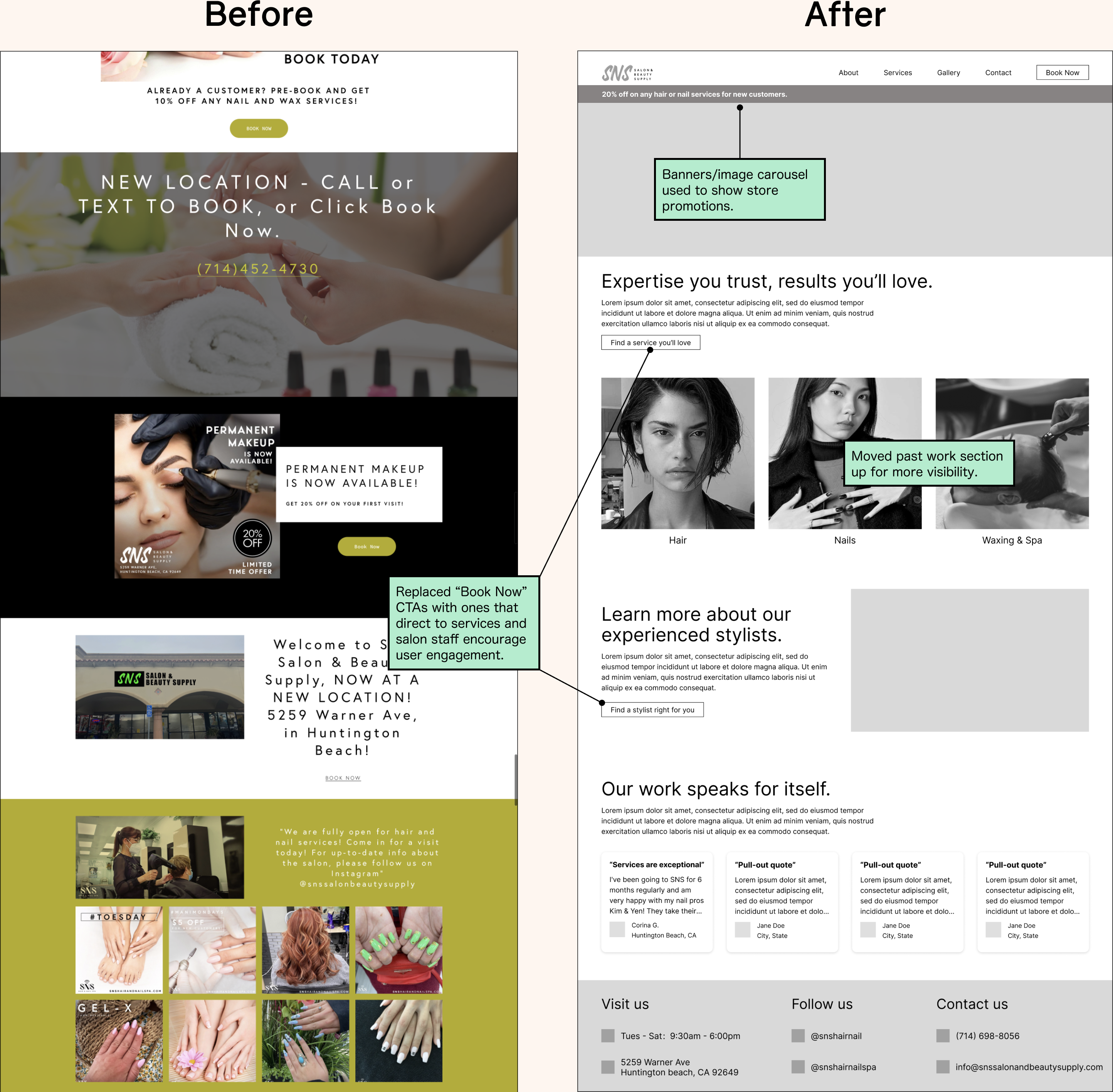
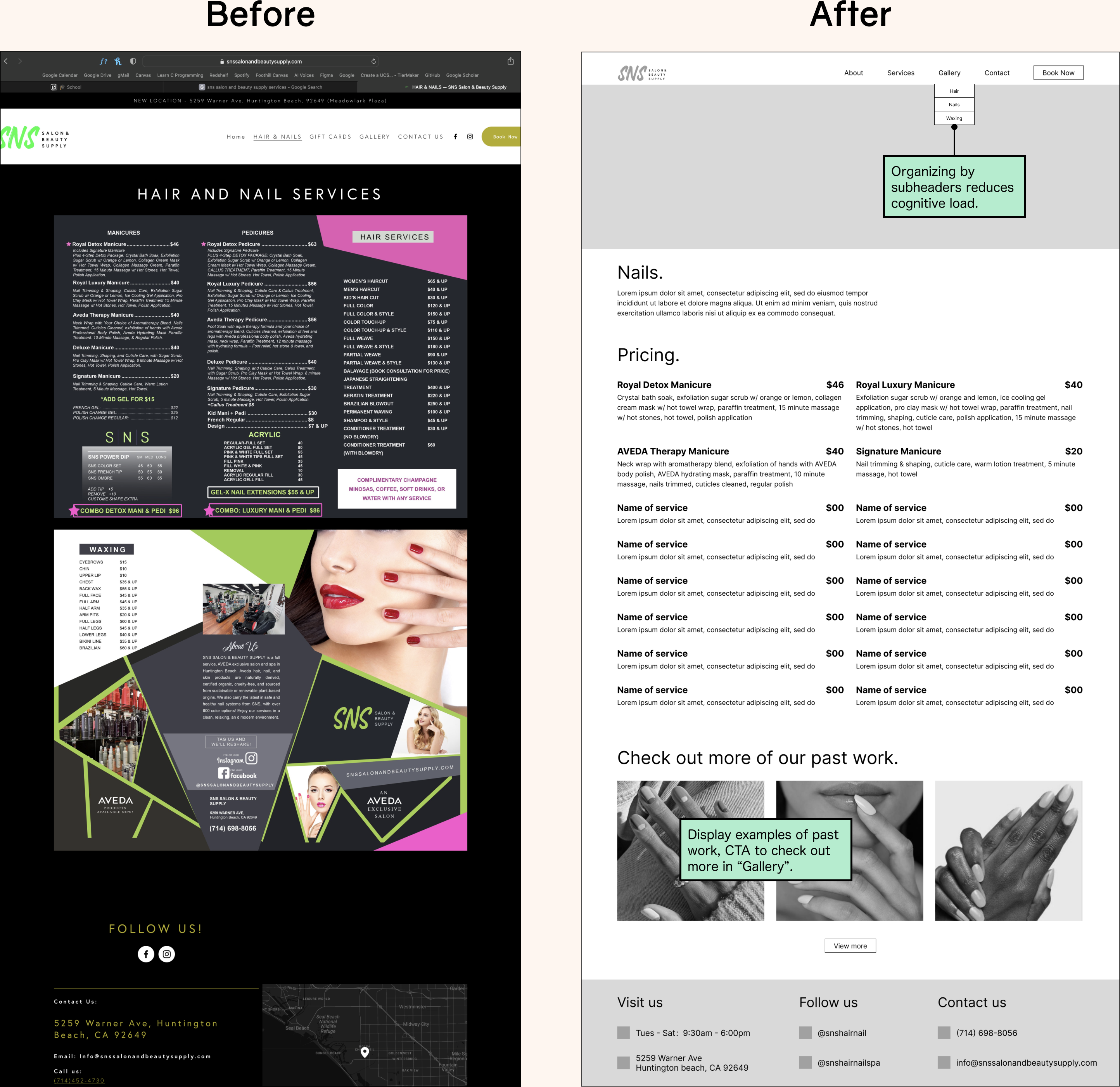
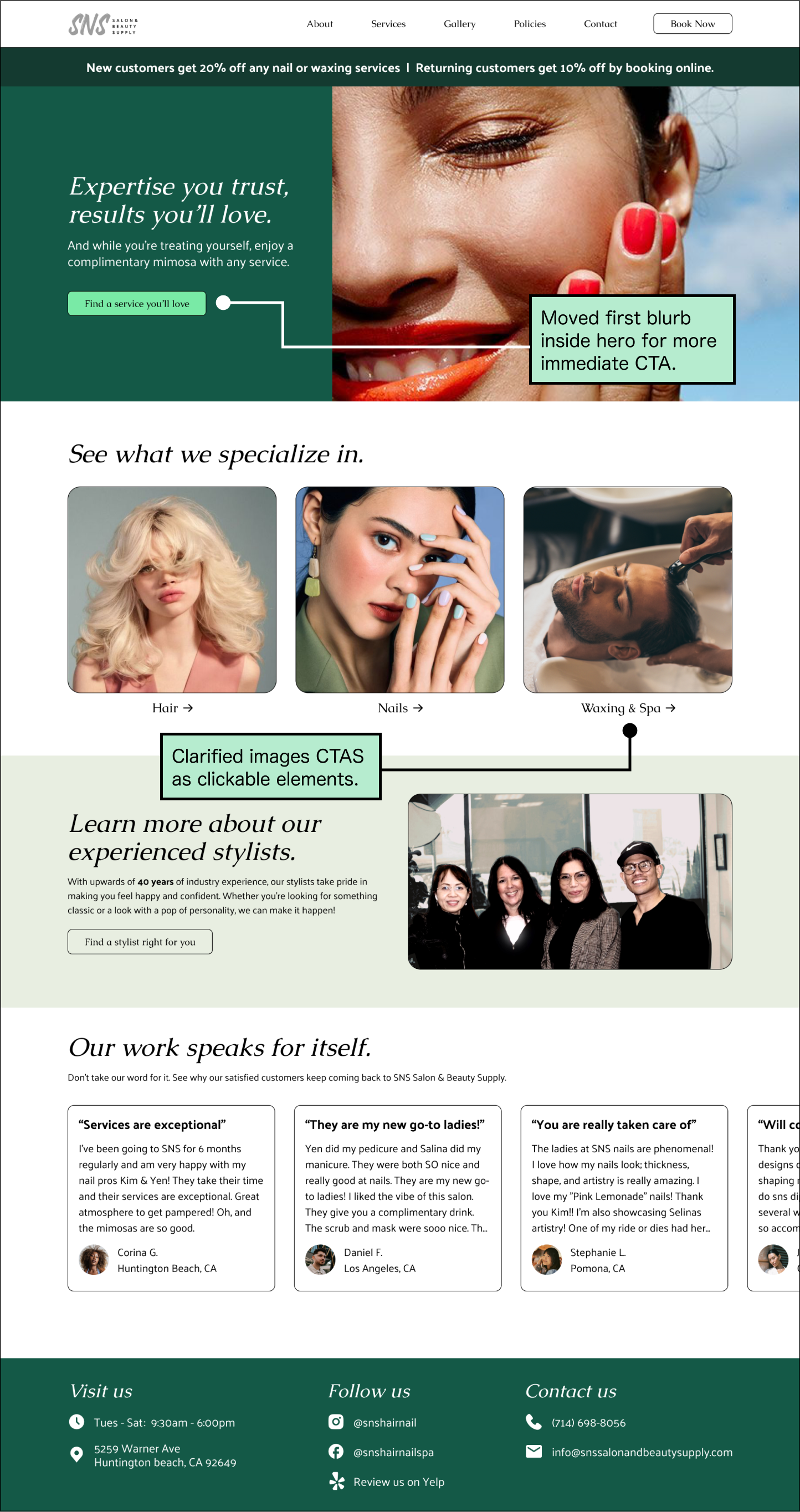
The redesigned SNS Salon & Beauty Supply website is built for both desktop and mobile screens.
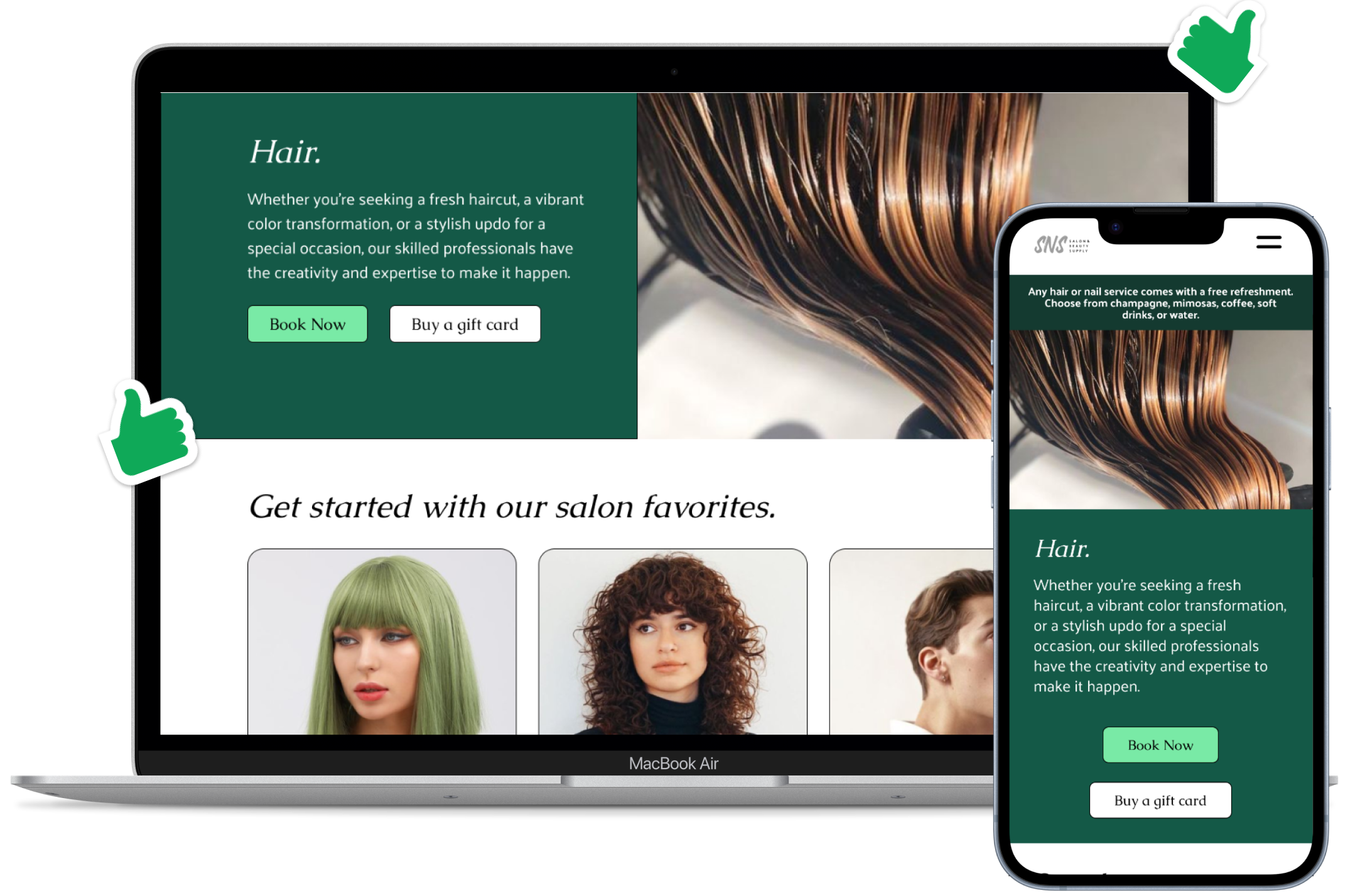
With a fresh look and feel, users can better resonate with the salon's story and easily find key information about the offered services.
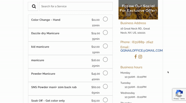
Say goodbye to a cluttered booking page, and say hello to smooth booking and exciting experiences to come.
Outcomes
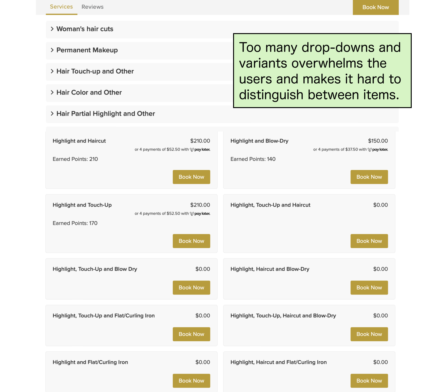
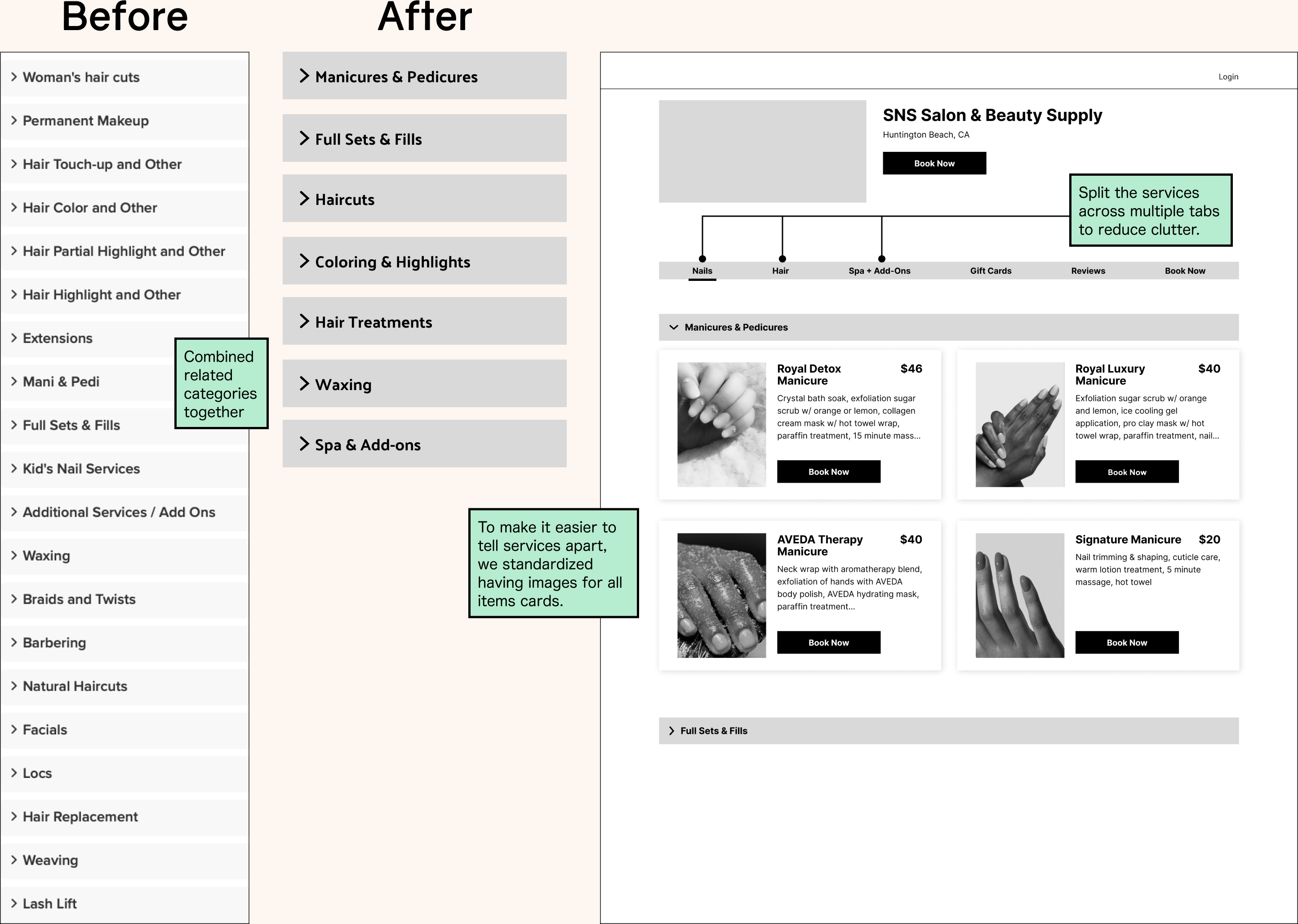
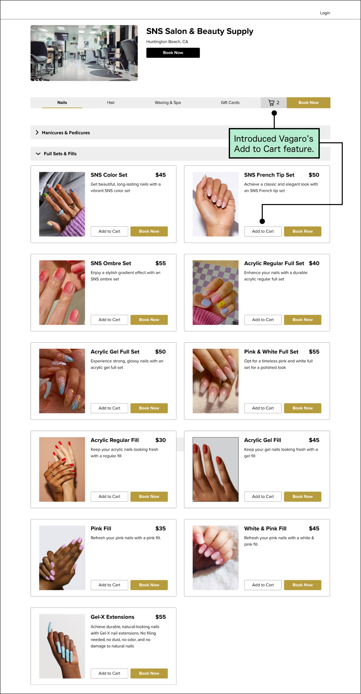
Streamlined service navigation by 55.6%
The booking experience left users confused due to excessive duplicates and variants. Standardizing service cards with existing Vagaro components led to faster booking.
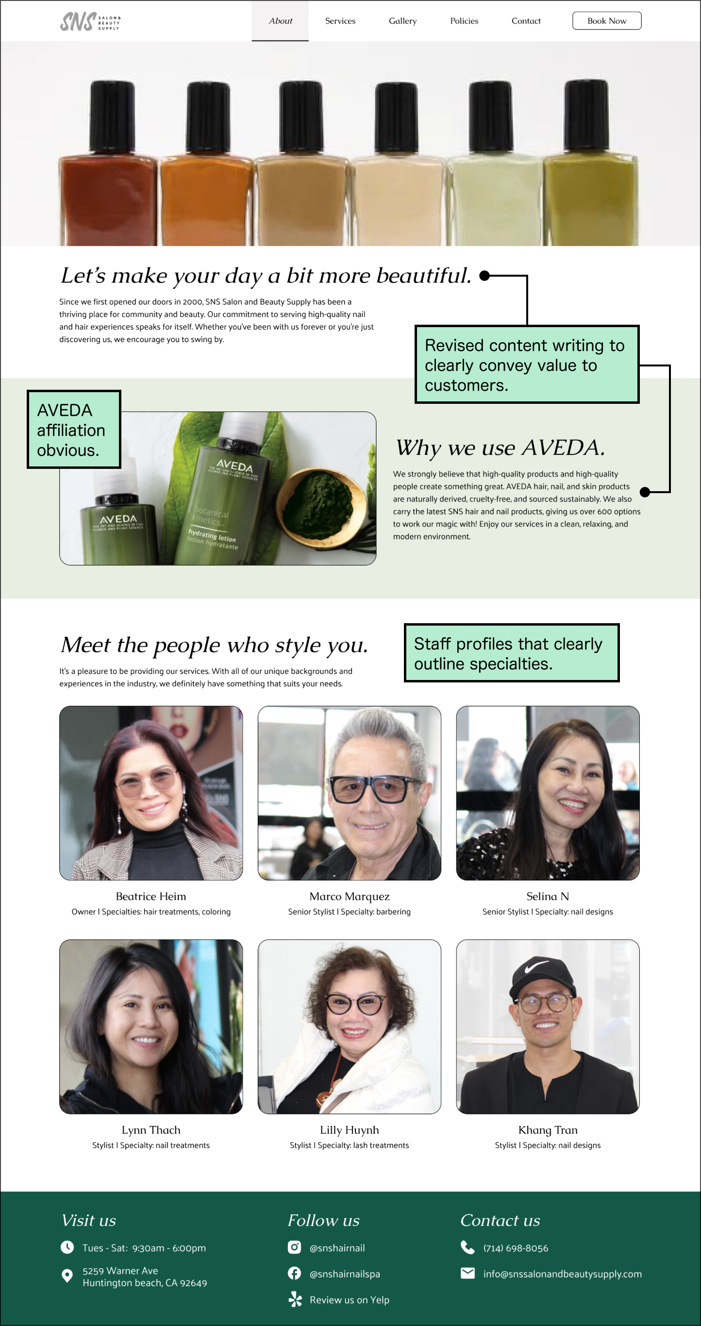
Since 2000, SNS Salon & Beauty Supply has specialized in providing nail and hair services for the local community in Huntington Beach from expert stylists who have been in their industry for decades, up to 40 years.
Problem
Speaking with the owner, we aimed to understand SNS Salon's mission, audience, and goals. From this, we focused on the core problems that our client wanted to address:

Beatrice Heim Owner
“Most of our customers find out through word of mouth, but we currently don’t have a strong online presence to promote the salon.”
“We want to appeal to young people, they want to pay for beauty and love to spend.”
“High-quality experience is what keeps the customers coming back, and we want a better way to promote the deals so hopefully we reach 200 5★ reviews on Yelp.”
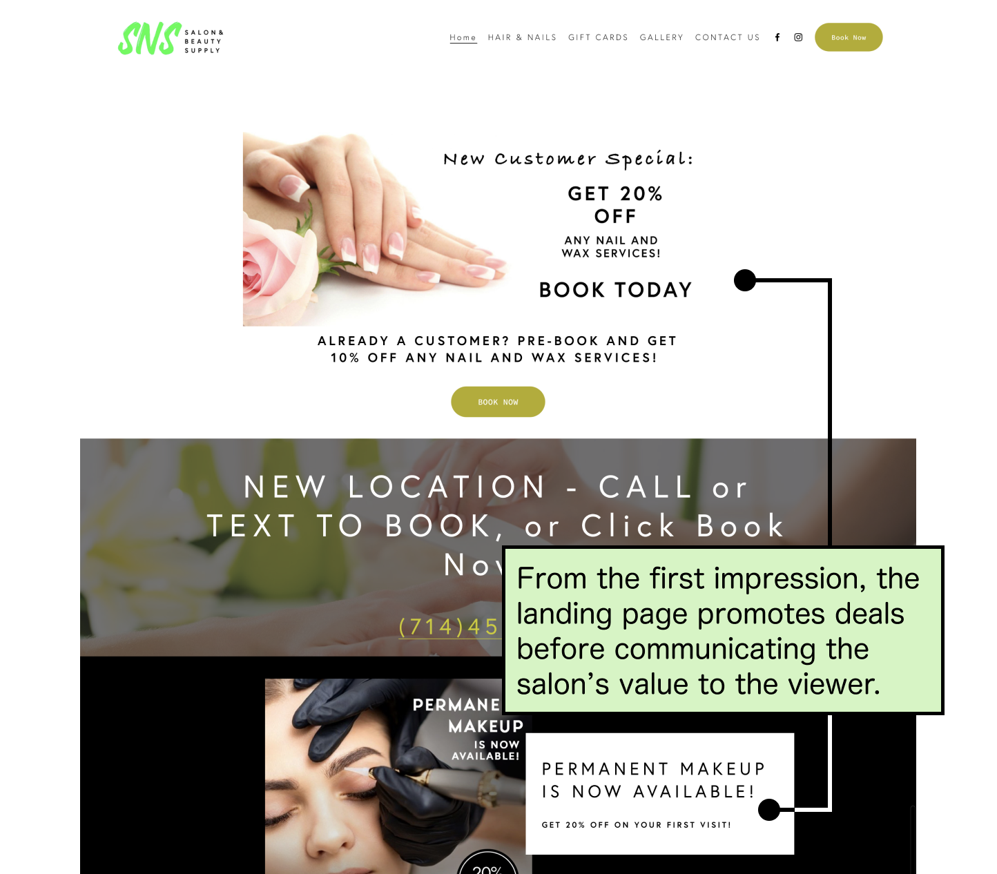
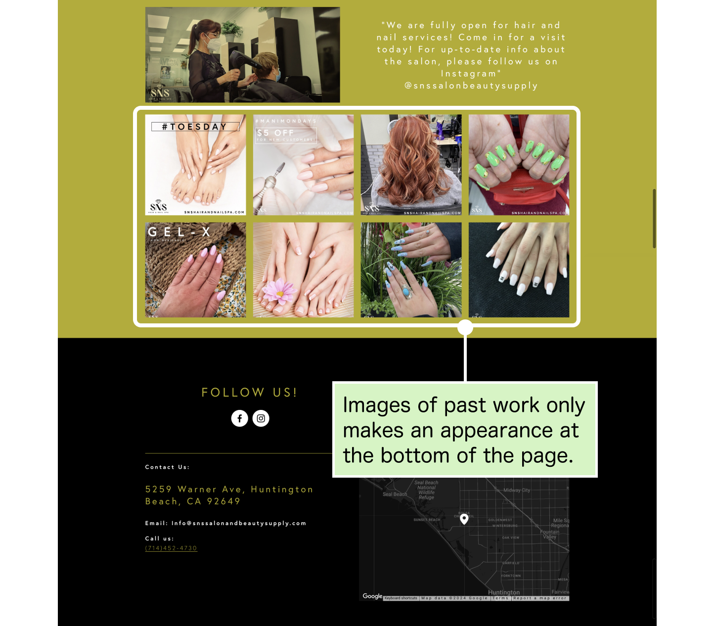
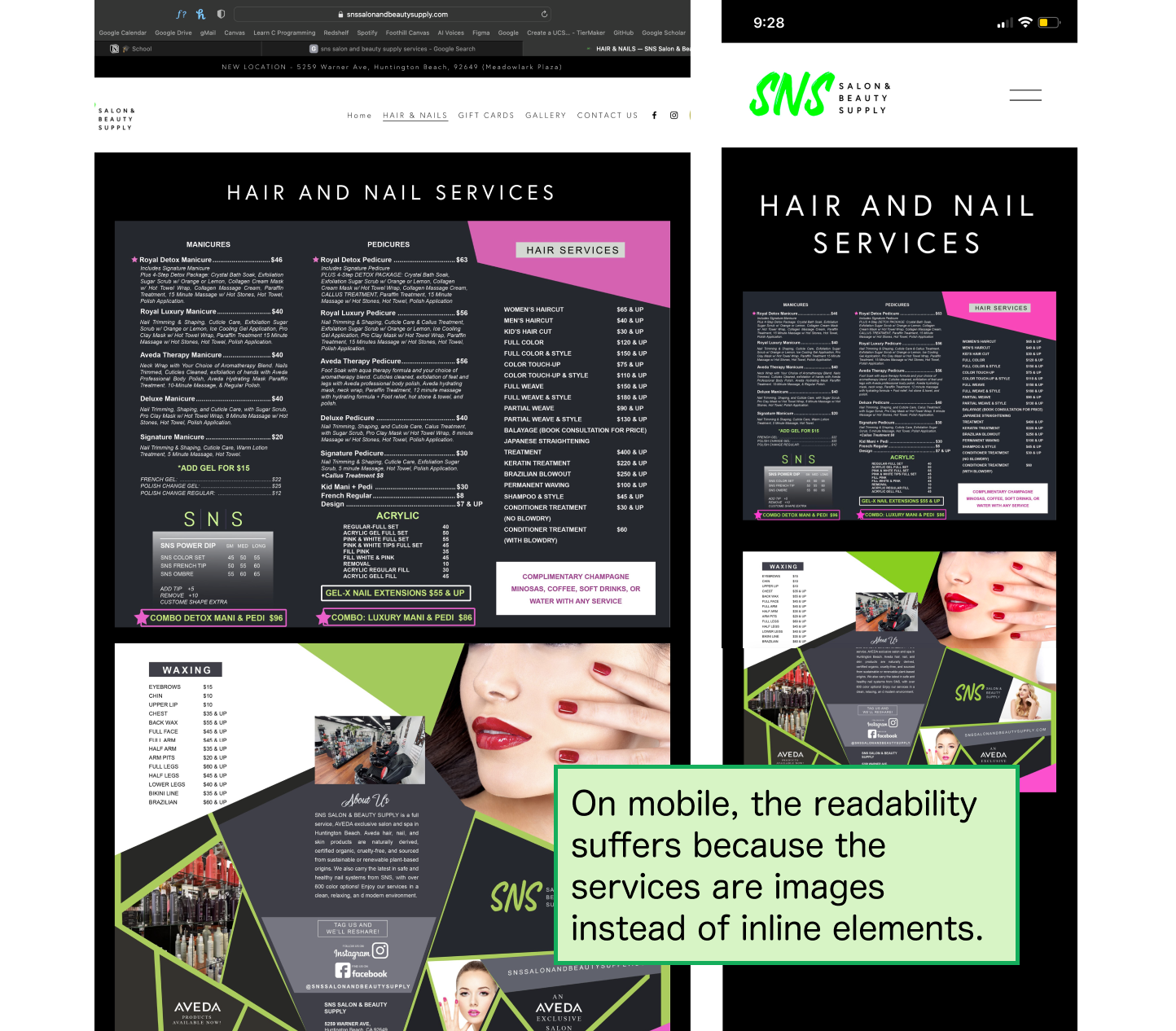
Website Audit
After taking a closer look at their current website, we found that visual clutter and usability issues hindered the website's ability to communicate the salon brand and core specialties.
Primary Research
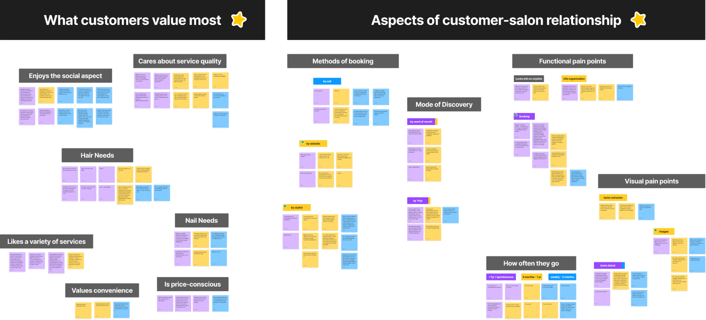
To better fit the site to its audience, we interviewed 12 salon patrons, including 3 from SNS Salon, about their motivations, booking habits, then did a think-aloud website walkthrough.
Due to the variety in the responses, it was hard to find immediate trends. So, I proposed we used an affinity diagram to organically categorize our data.
At first, we thought customer habits would vary by age, but we found patterns in how people form relationships with their salon and what they value most in the experience.
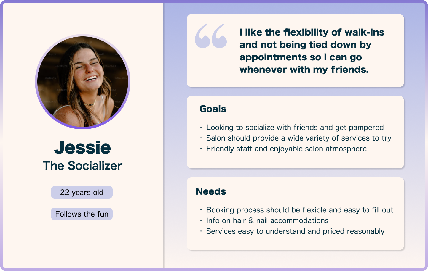
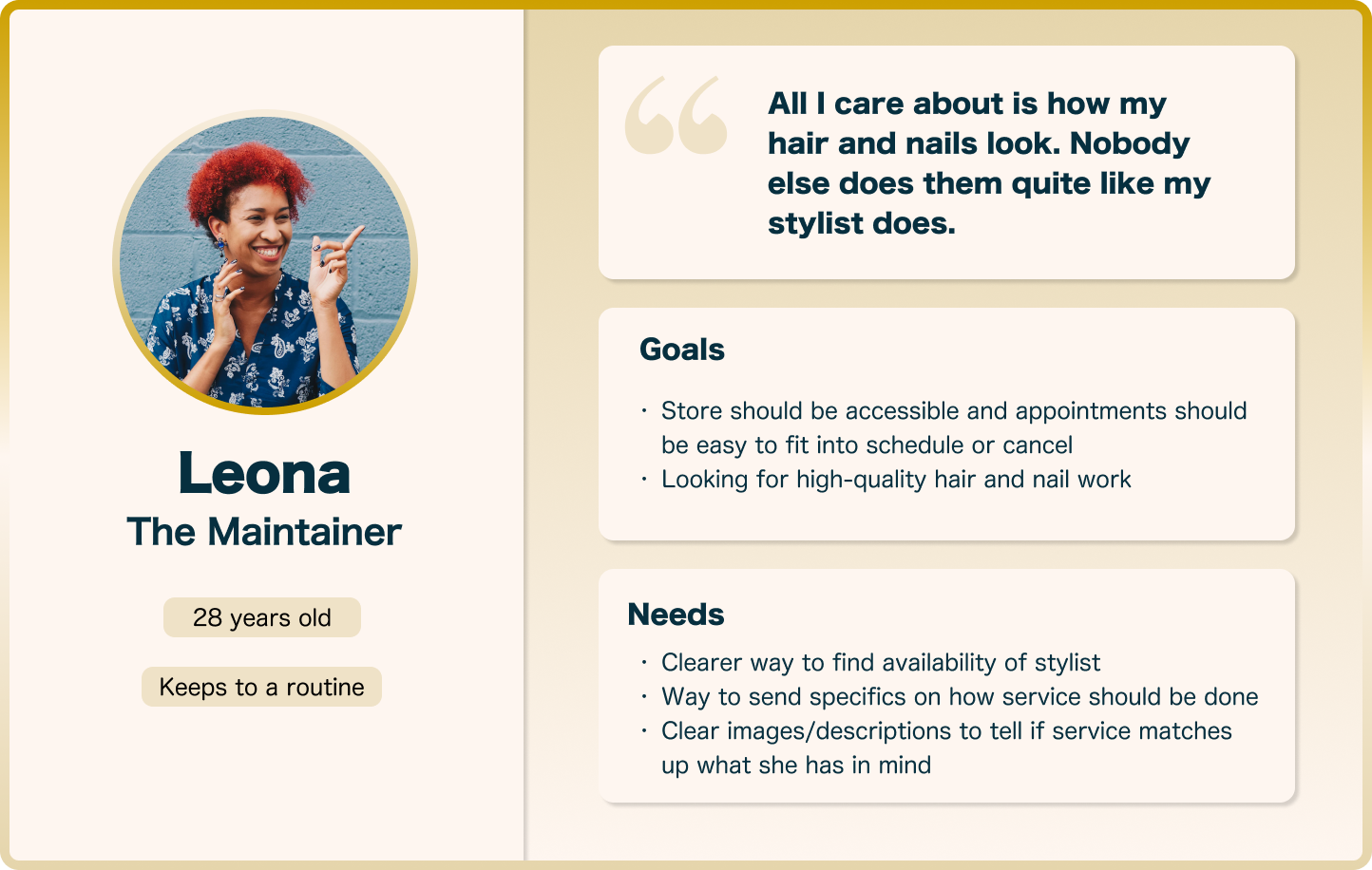
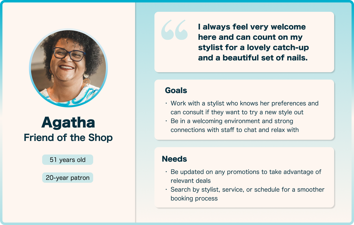
User Personas
After we identified the themes, we went back and compared them with individual responses to characterize the patterns. Here is how we defined our customer stakeholders:
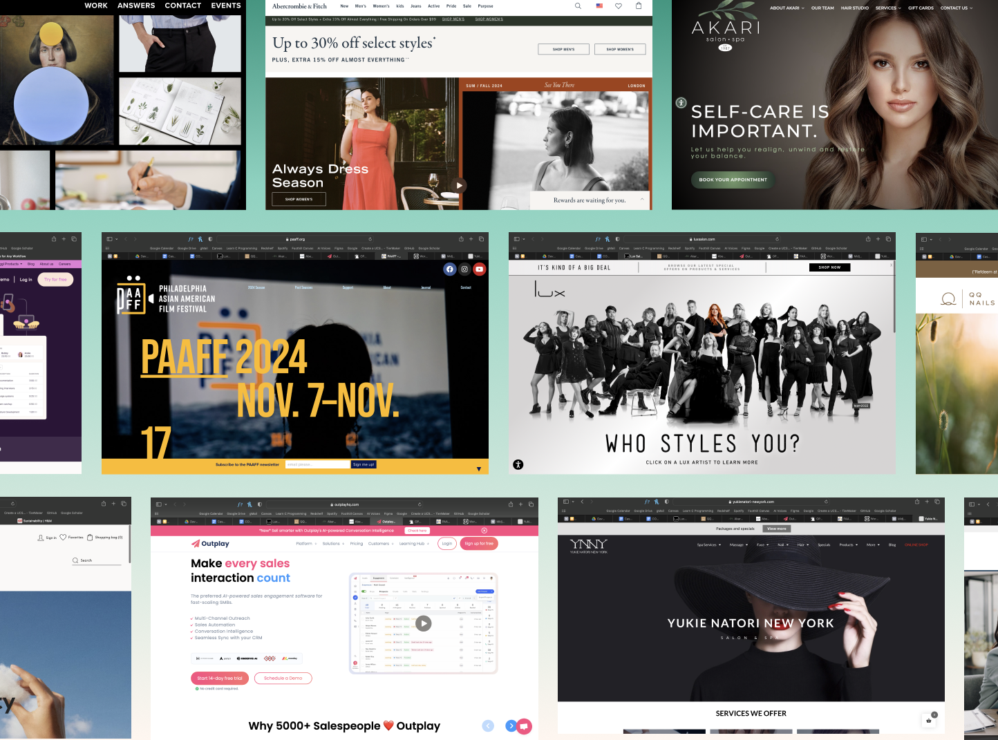
Competitive Analysis
Once we had a better understanding of the customer base, we needed to know how to blend user needs and design conventions in order to suit our client's business goals.
And so we ran a competitive analysis on 10+ websites, catering in and outside of the nail tech field to gather a diverse pool of examples to reference from.
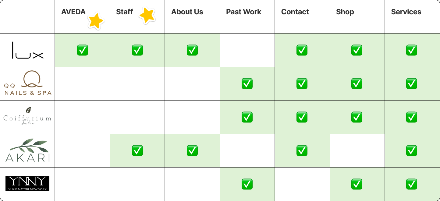
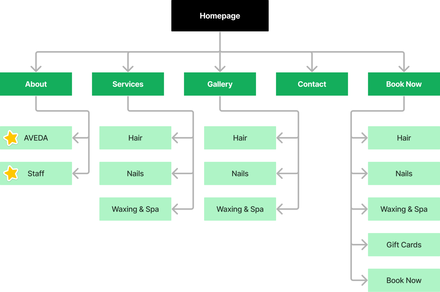
Information Architecture
Just looking at nail salon websites, we broke down how they structured their navbars.
Few salons highlight their AVEDA affiliation or staff expertise. SNS Salon could take advantage of their niche, and it could look something like this:
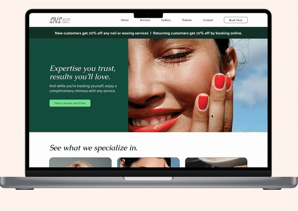
Landing Page
Landing pages with defining traits have a strong message that validates user needs. The examples below use storytelling to balance user impact and the business side.
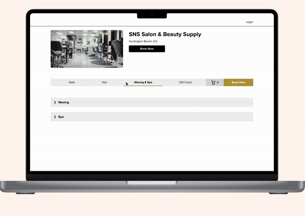
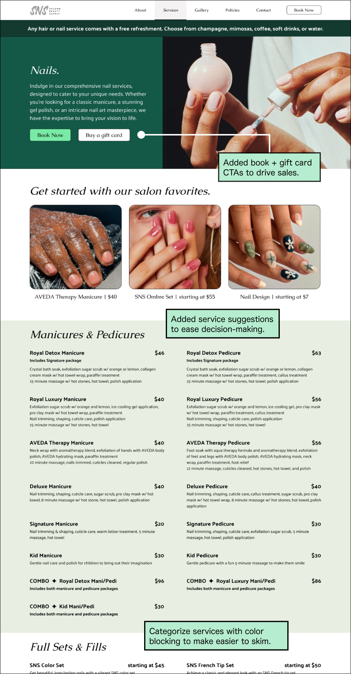
Booking
Content-heavy pages on other websites felt less overwhelming and easier to search through due to how the information was spread out and prioritized on a page.


Ideation
Our high-priority goals at this stage were to improve user navigation and reformat their content. Planning ahead, we decided to slightly increase the fidelity to include B/W images and basic descriptions so participants become more immersed in user testing activities.
User Testing
To determine if the screens were clear and easy to navigate, we did user testing with 3 participants and ran through various user scenarios for both desktop and mobile.


Testing Insights
The user feedback revealed that we fixed most major usability issues and onboarded them to SNS Salon's strengths, but we also got insights on what still hinders users from completing their goals.
Easy to glean information
Easily figured out what the salon specializes in and were able to look through the services without being overwhelmed.
Displayed deals without sacrificing customer value
Successfully recalled the promotional ribbon on the top after walking through the website and tasks.
Usable, but not useful
Service pages' minimal layout felt wordy and bland, which didn't help decision-making.
→ Revise the pages from a user goal perspective, play with visual elements, and rework service descriptions if applicable.
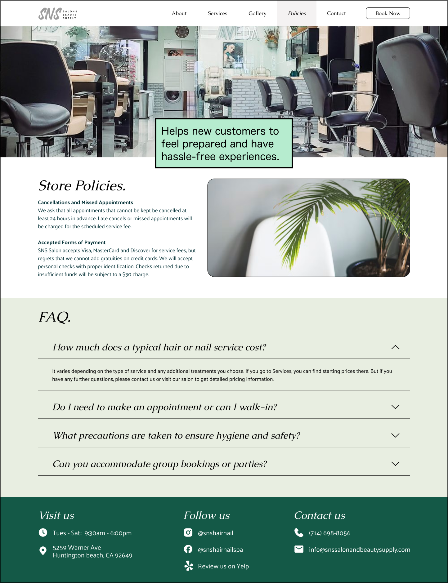
Hard to get logistical answers
Found it unintuitive to find store policies and had follow-up questions even after reading.
→ Add a dedicated section in the main website for store policies and include FAQs for clarity.
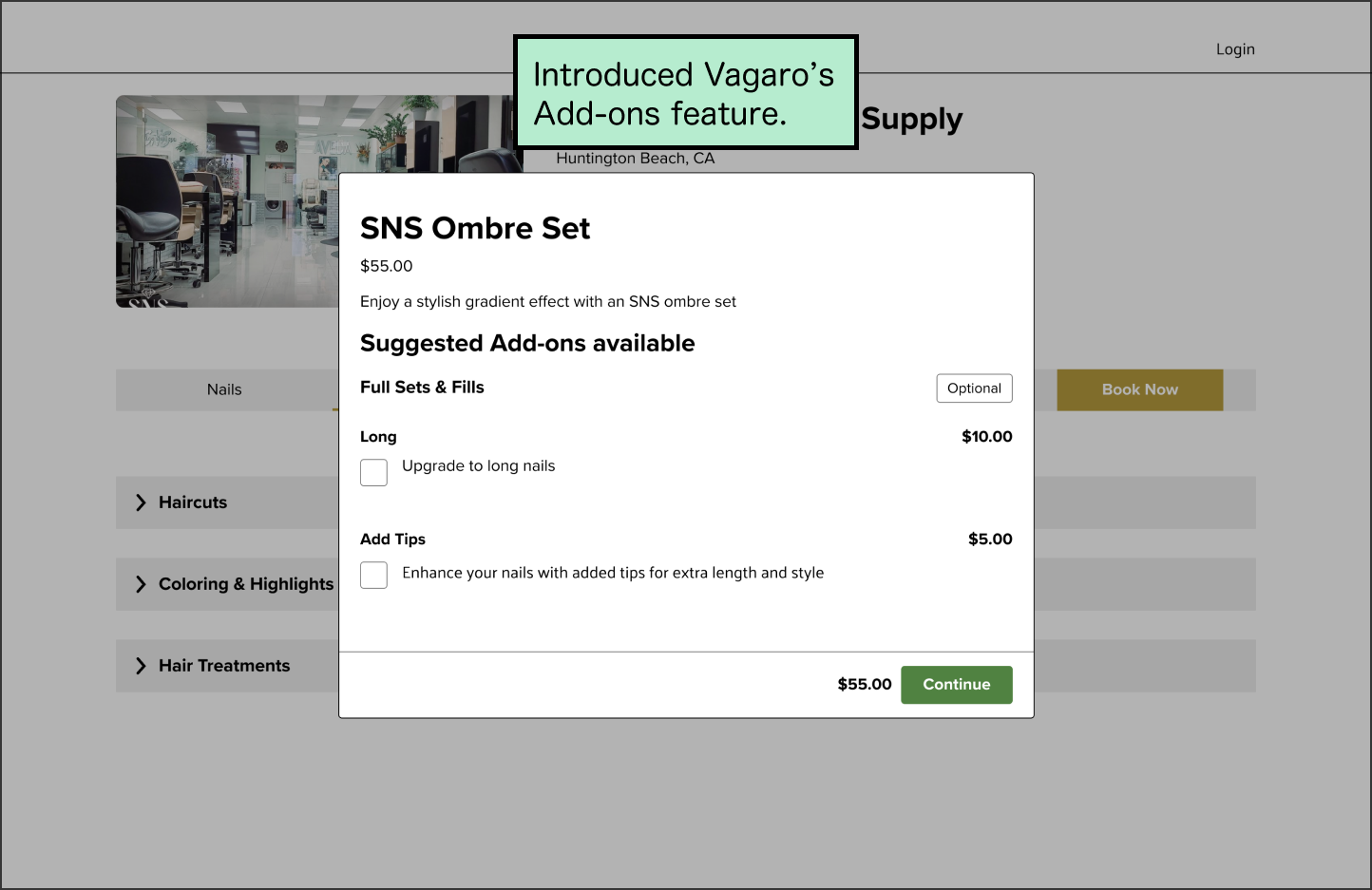
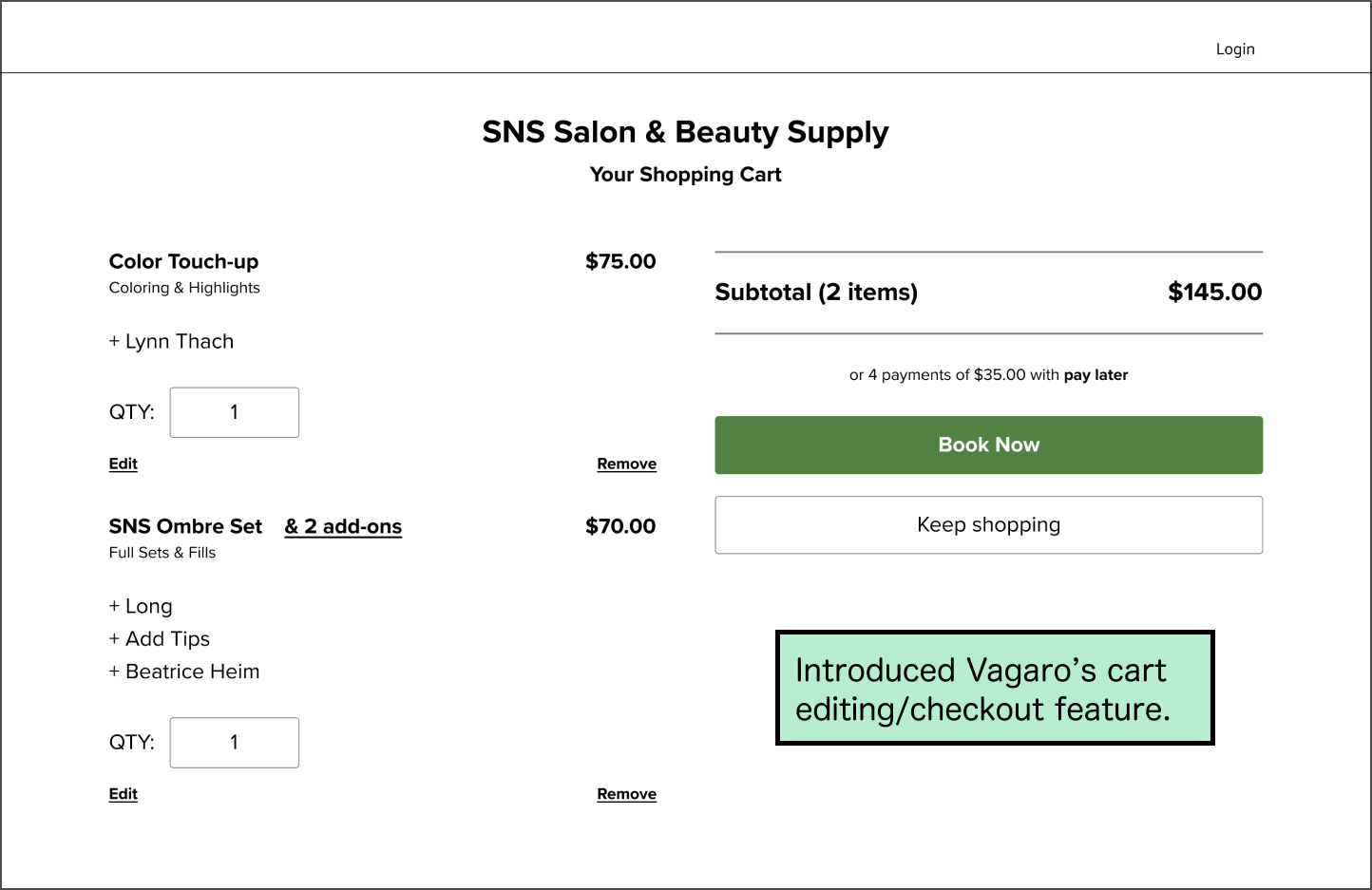
Booking lacks user freedom
Users could only see the total cost at checkout and couldn't easily change appointment details if they wanted to.
→ Do more research on Vagaro to see if the platform has features that support a seamless end-to-end booking experience.
At this stage, my team and I begin to replace placeholder content, apply our design systems, and continually test and iterate our designs.
Visual Design
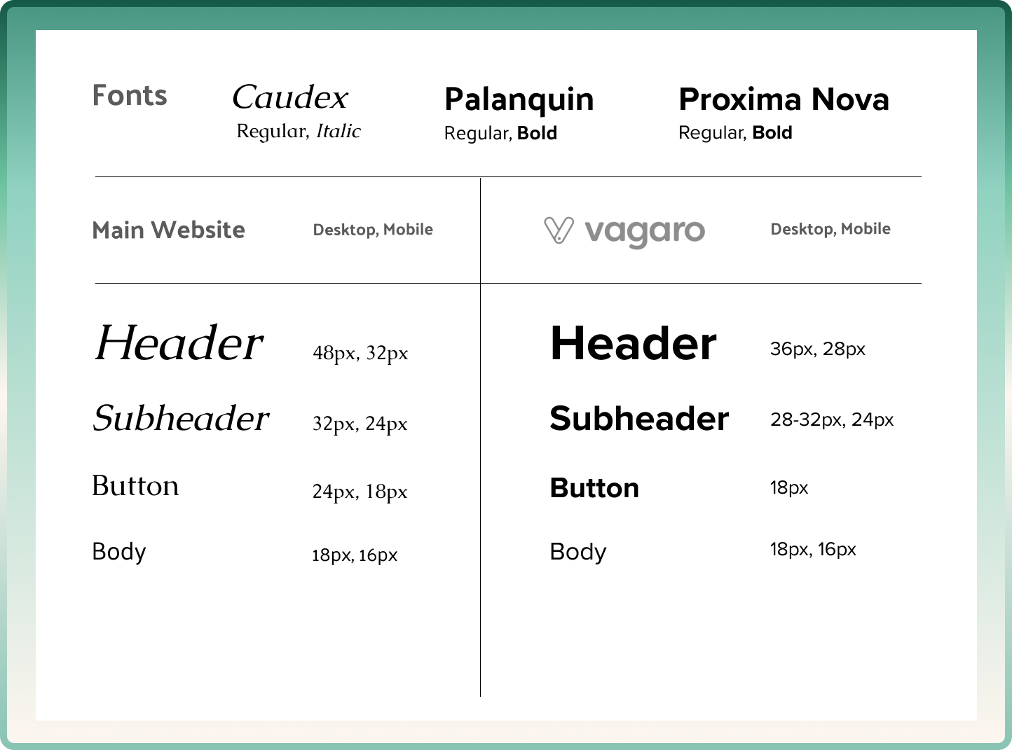
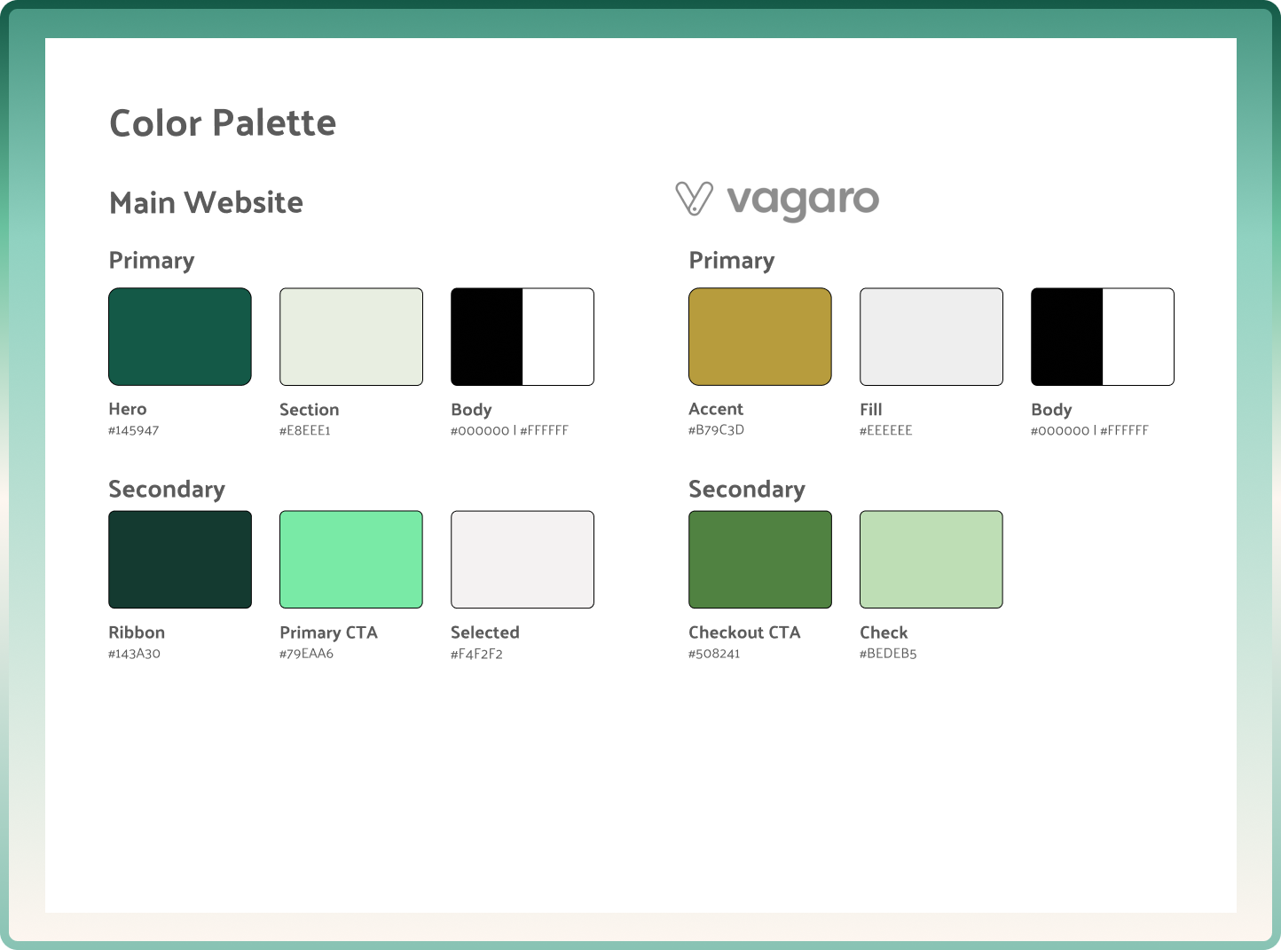
In addition to making one for the main website, we also needed to replicate the Vagaro design system. So, we used a font identifier extension that retrieved font sizes and weights.
Iteration
Future Iterations
Website metrics
If I had access to the analytics, I would track the number of appointments booked and Yelp reviews made, and bounce rates post-launch, to see if any further iterations could be made.
Revamping their social media
If we were to do further work, I would revisit the salon's social media to find ways to attract more traffic to the website.
Every new client always gives me new perspectives in terms of approaching design. I never would have thought how rigorous website design would be. By continuously iterating on hundreds of screens/assets, I feel confident and better equipped in taking up similar projects in the future.
And what did I learn?
Knowing how to know. I learned the importance of keeping track of core details. When there’s always new insights and developments, I realized that investing in concise summaries really paid off, as it saved much needed time and effort.
Website design opened up my eyes on how intention and UX principles can apply to every element, no matter how big or small. It taught me that there’s more than one approach to design and hundreds of other fields that I can take inspiration from.