How we recharged and refreshed the sleeping pods
We redesigned the sleeping pods for easier maintenance and better rest quality, adding aromatherapy for boosting muscle recovery and student productivity.

My Role
Project Manager
Team
1 Project Manager
2 UX Researchers
1 UI/UX Designer
Skills
User Research
Design Systems
Usability Testing
Physical Prototyping
Timeline
7 weeks
Oct. 2023 - Dec. 2023

Table of Contents
We redesigned the sleeping pods for easier maintenance and better rest quality, adding aromatherapy for boosting muscle recovery and student productivity.
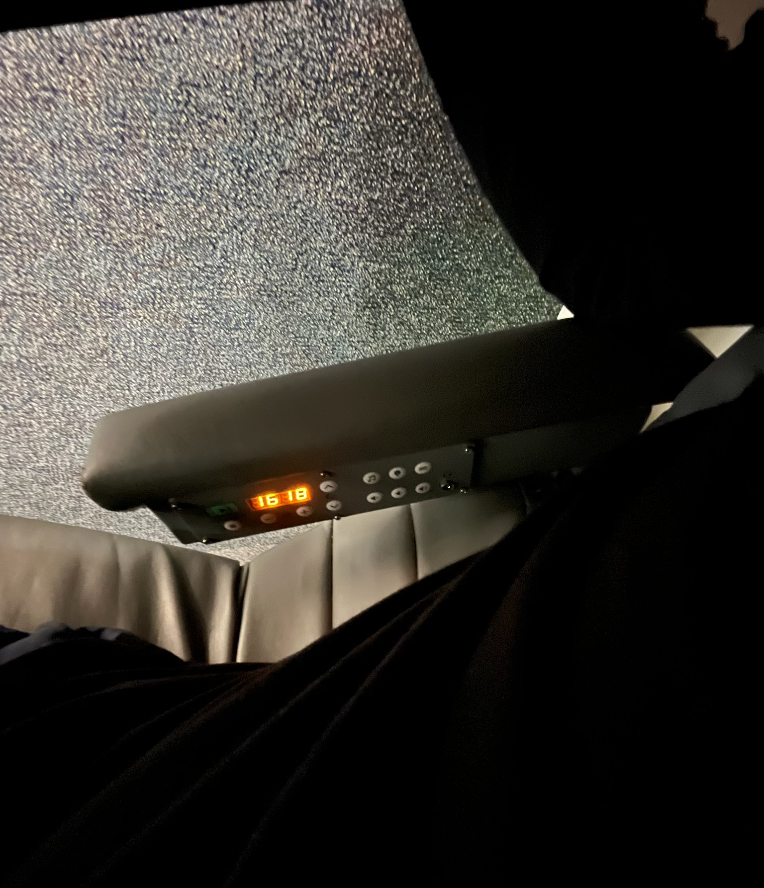
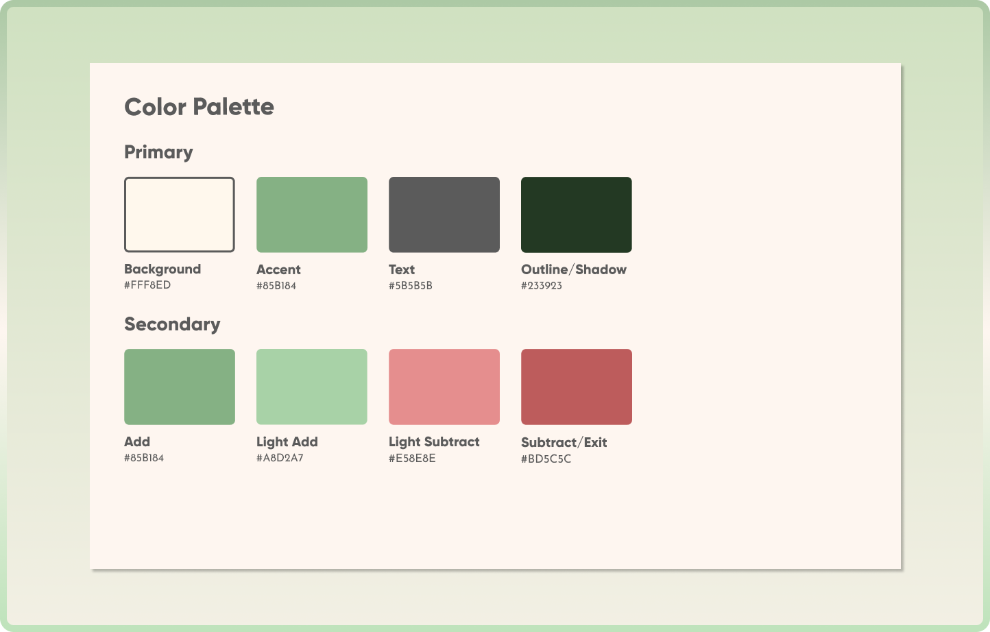
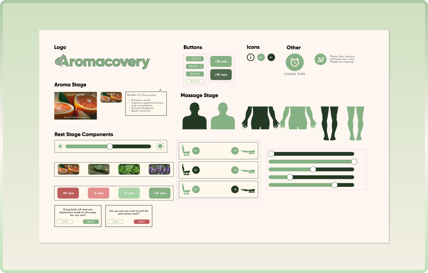
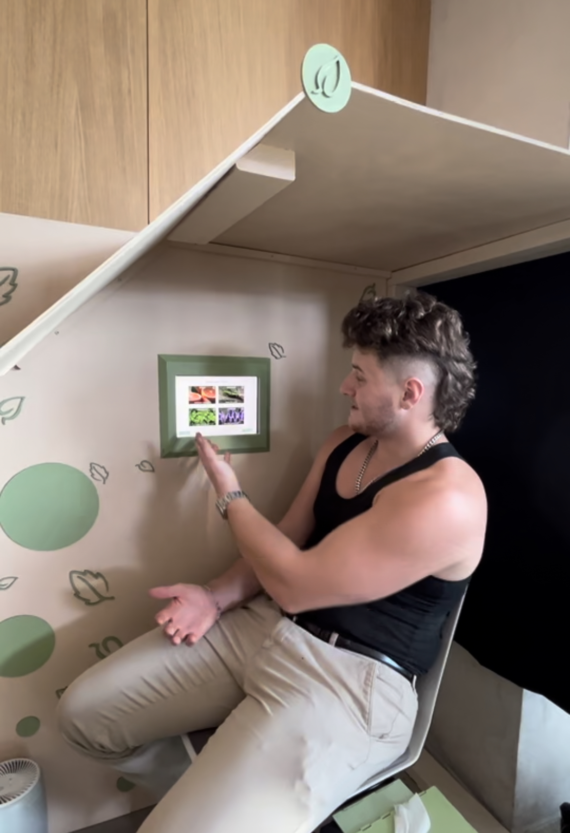
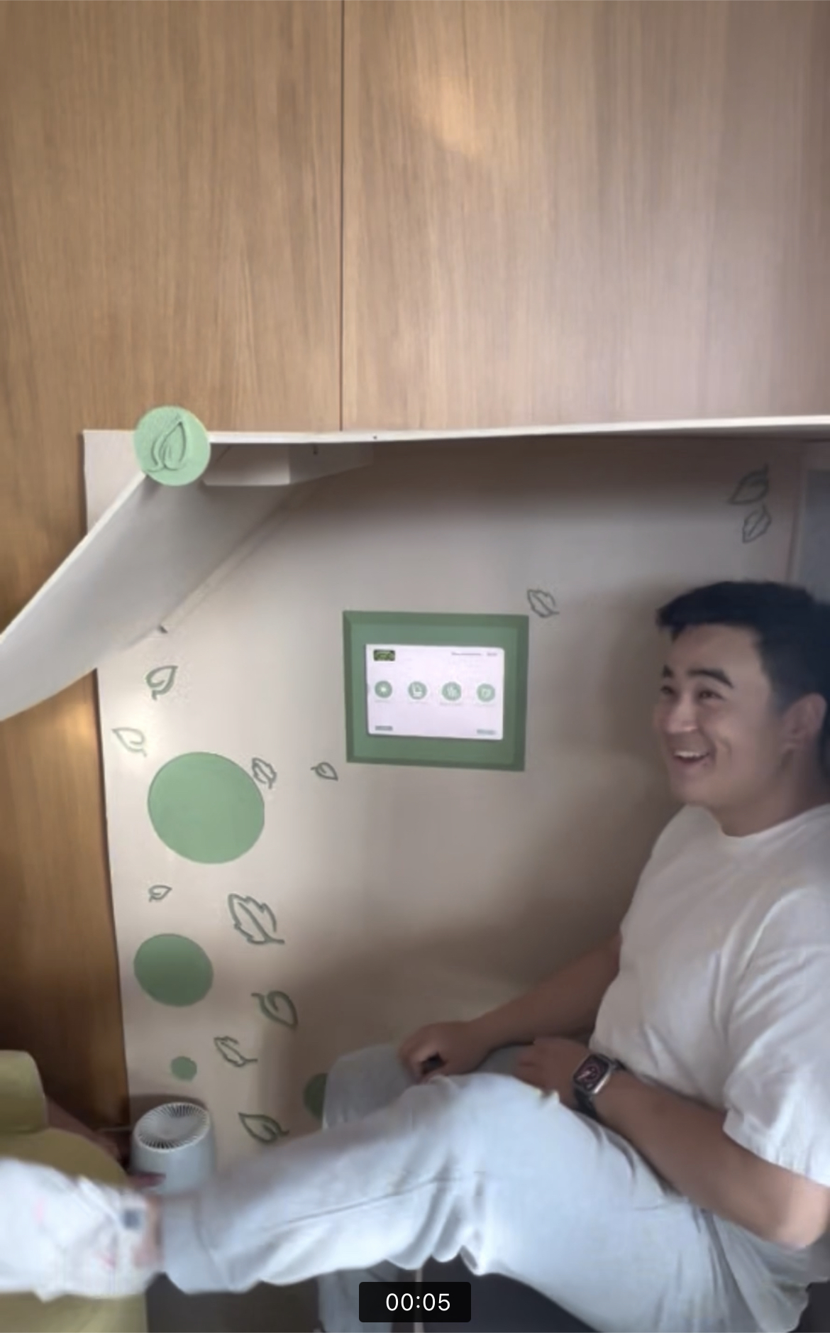
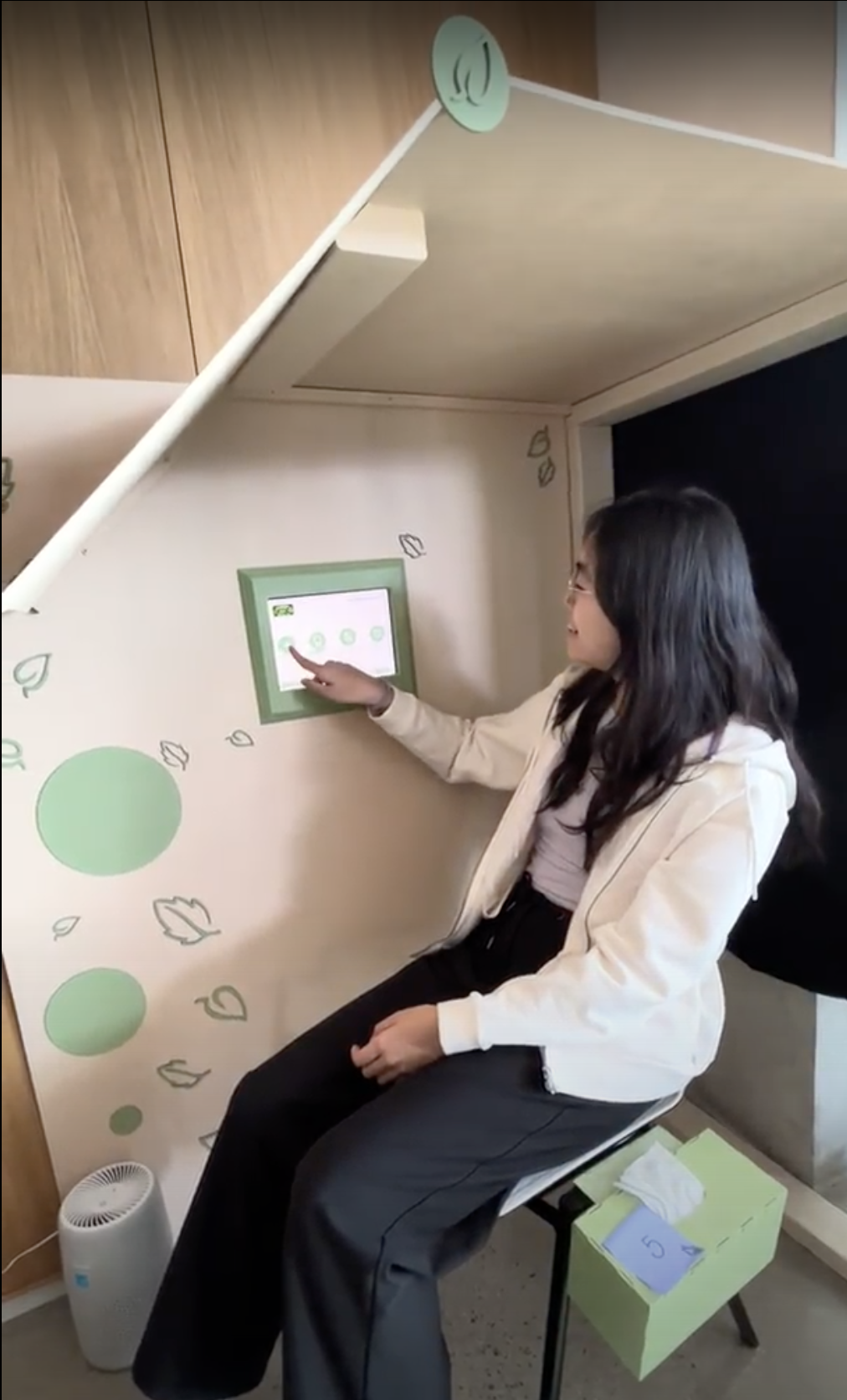
Interface
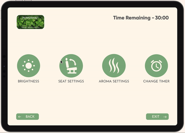
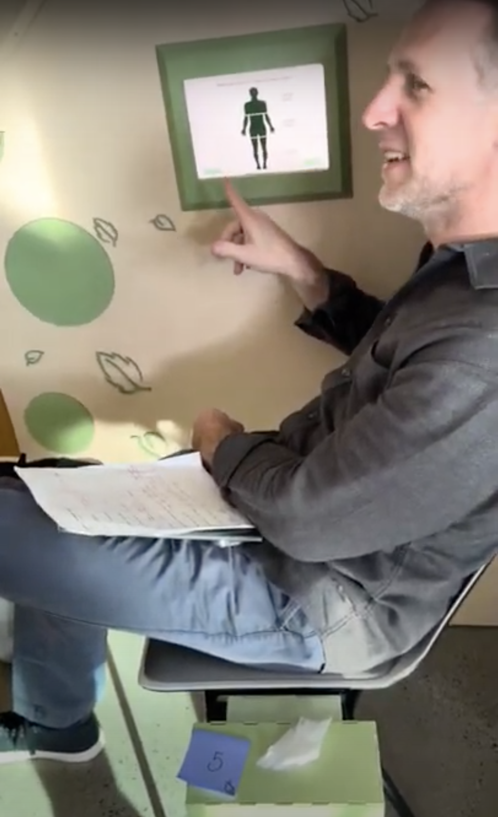
The user can choose which aromatic benefits to receive, where to ease body tension, and how long they want to rest in order to suit their individual needs.
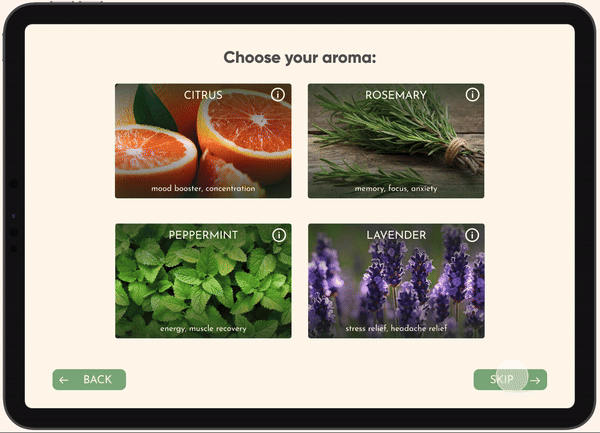
Per Nielsen's 3rd usability heuristic, we ensure the user always has control of their experience, whether they want to dim the screen or they aren't fully satisfied with the aroma.
After the time is up or the user leaves early, the interface prompts them to use the cleaning wipes to ensure the space is clean for the next person.
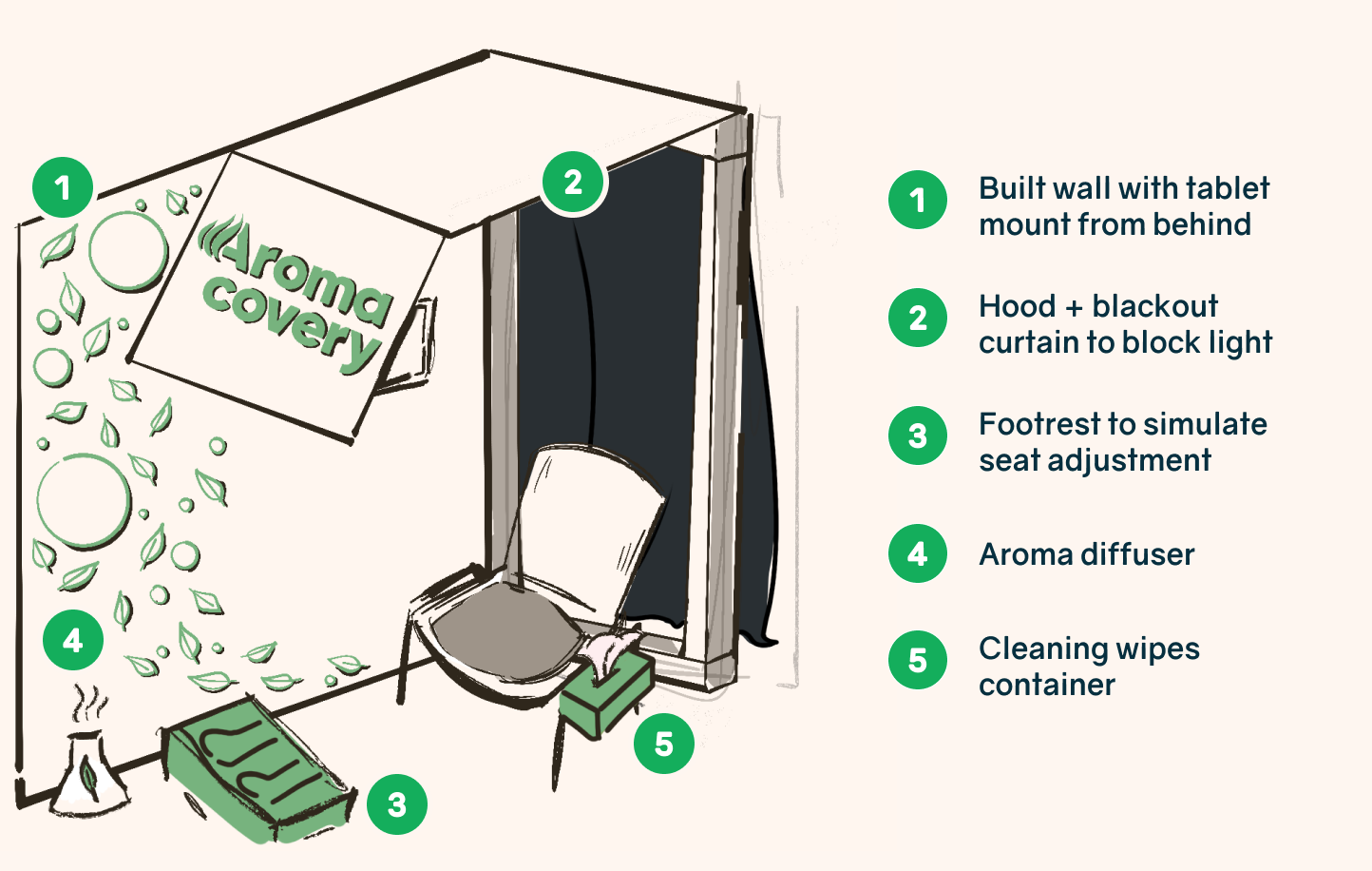
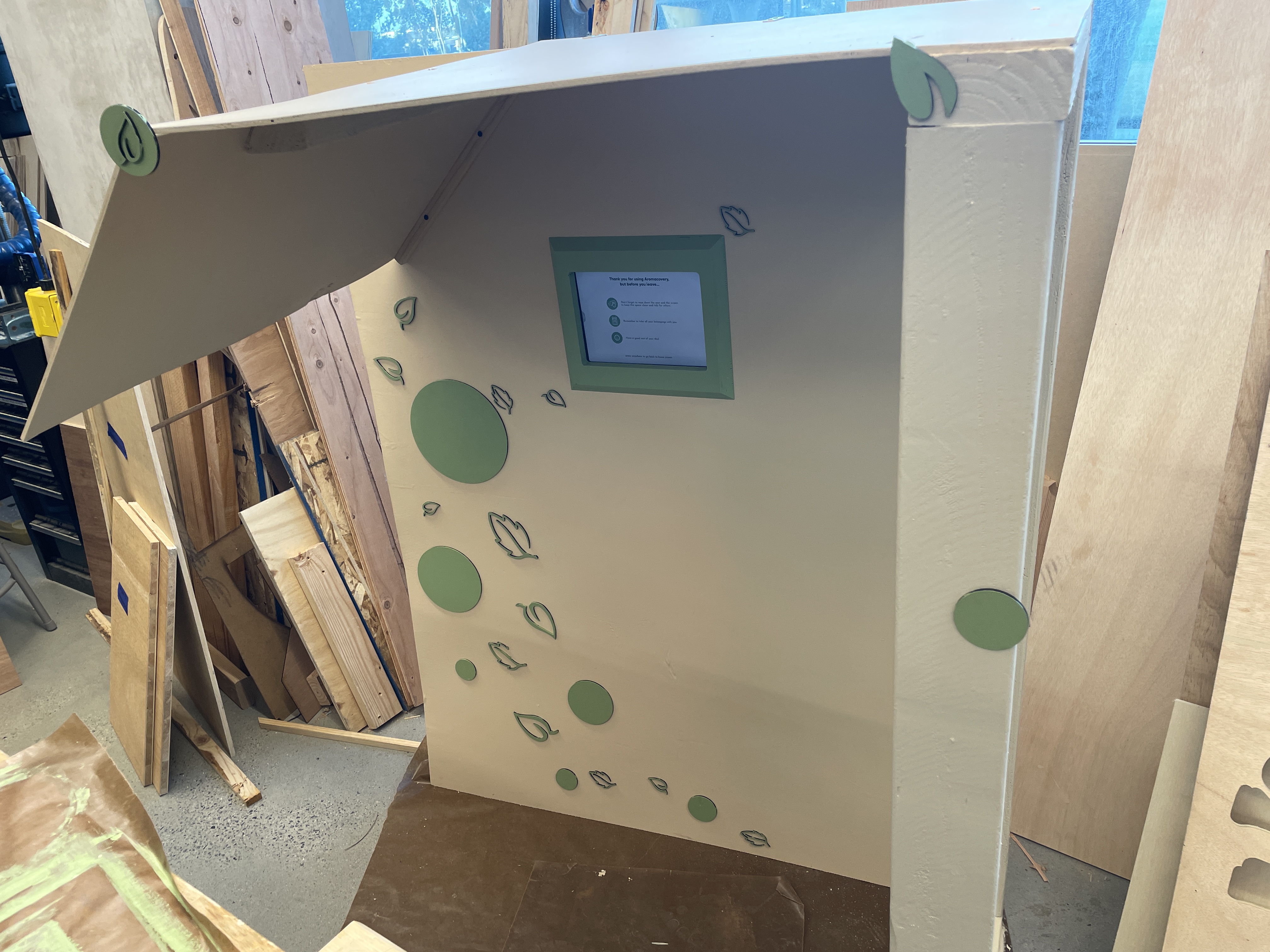
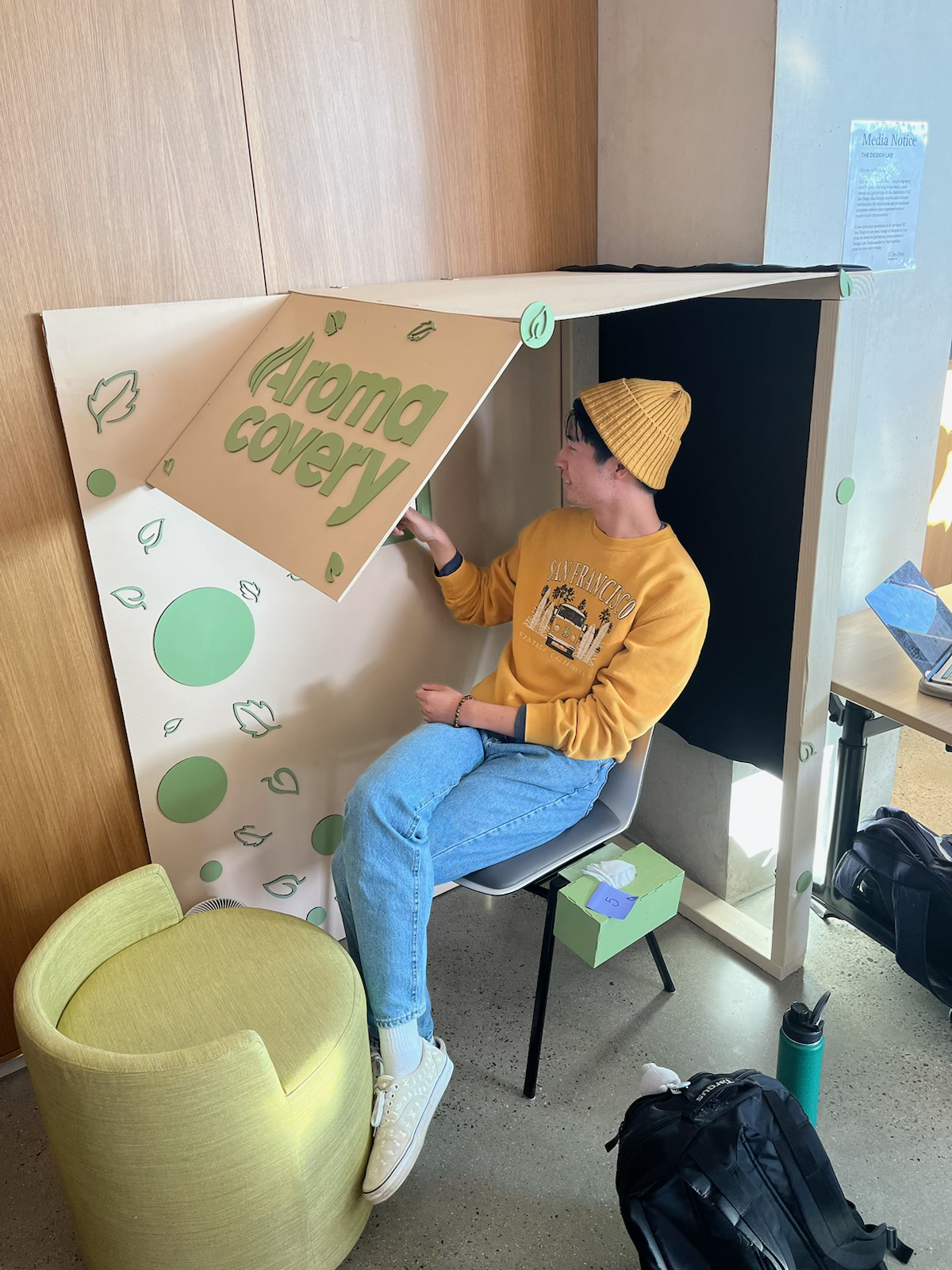
Kiosk
With a more approachable physical setup, users can better ease into their pod session knowing the space is well maintained and suited for their needs.
Outcomes
The average workflow duration sped up by 13%
From the first round of user testing, we identified key pain points in specific interactions. During the showcase, we ran user tests and discovered a significant improvement in the user flows.
"Aromatherapy is something extremely lucrative. I work with the startup spaces, and they’re always trying to create calming spaces for chaotic places like airports and tourist destinations. I see the value proposition...and you can leverage that to secure some big name investors and clients."
 Christiana Russell
UCSD Office of Innovation and Commercialization
Christiana Russell
UCSD Office of Innovation and Commercialization
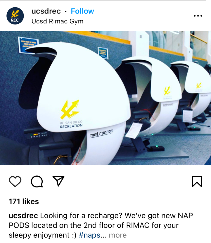
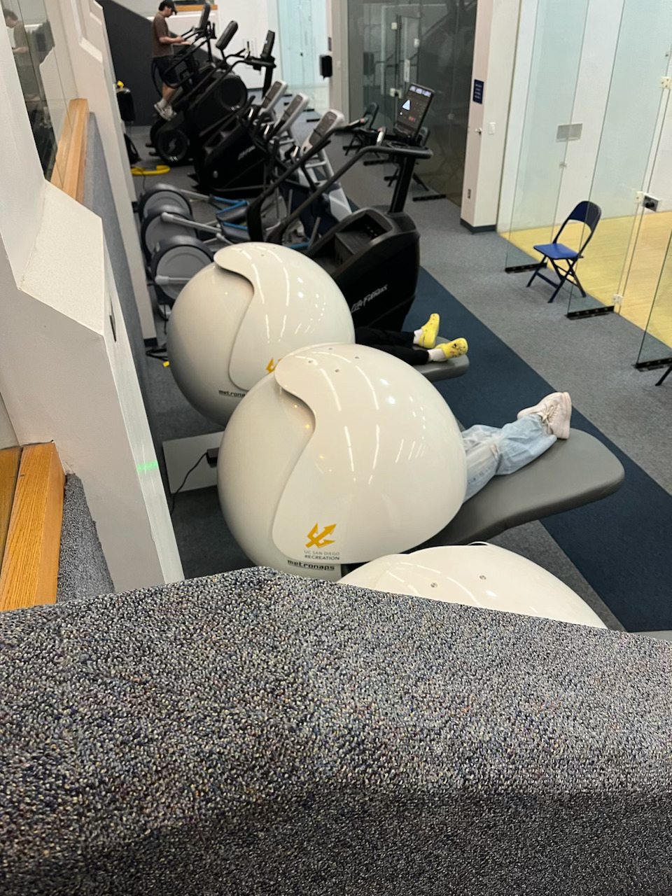
Circling back to 2019, UCSD had invested in MetroNaps™ sleeping pods for RIMAC, the most popular campus gym. In addition to serving gym-goers, the recreation department also marketed them toward regular students who may need a quick energy boost.
Problem
Although MetroNaps™ sleeping pods have found success in well-known corporate workspaces (Google and FedEx to name a few), our exploratory field research at RIMAC found that they are not effectively helping students rest because:
Poor sleeping environment
Noisy due to the nearby gym equipment and heavy foot traffic.
Lack of cleanliness
The seats inside were visibly sweaty, odorous, and partially broken.
Limited usage
Most students who sat inside used them briefly, either out of unfamiliarity or due to the environment making it hard to rest.
Secondary Research
After gaining some initial insights about the sleeping pods, I decided to conduct online research to learn what makes a public space self-sufficient, as well as deepening my understanding of workout recovery and academic burnout. Here's what I gathered:
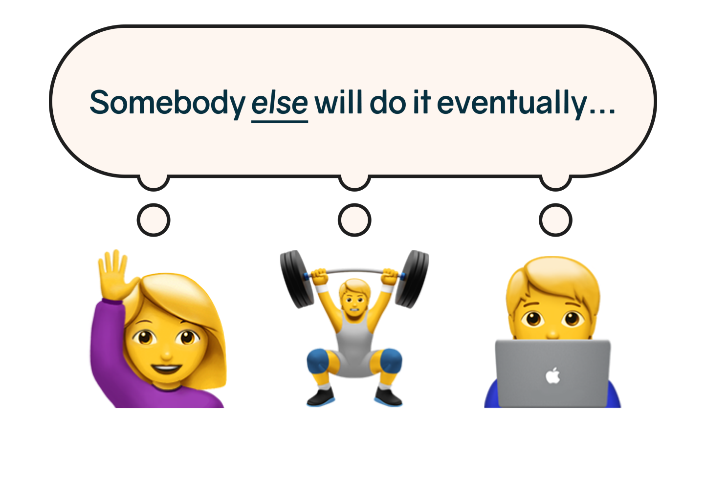
Diffusion of responsibility
When people wait for someone else to act instead (e.g. a cleaning staff member), the experience becomes less satisfactory for everyone if nobody steps up.
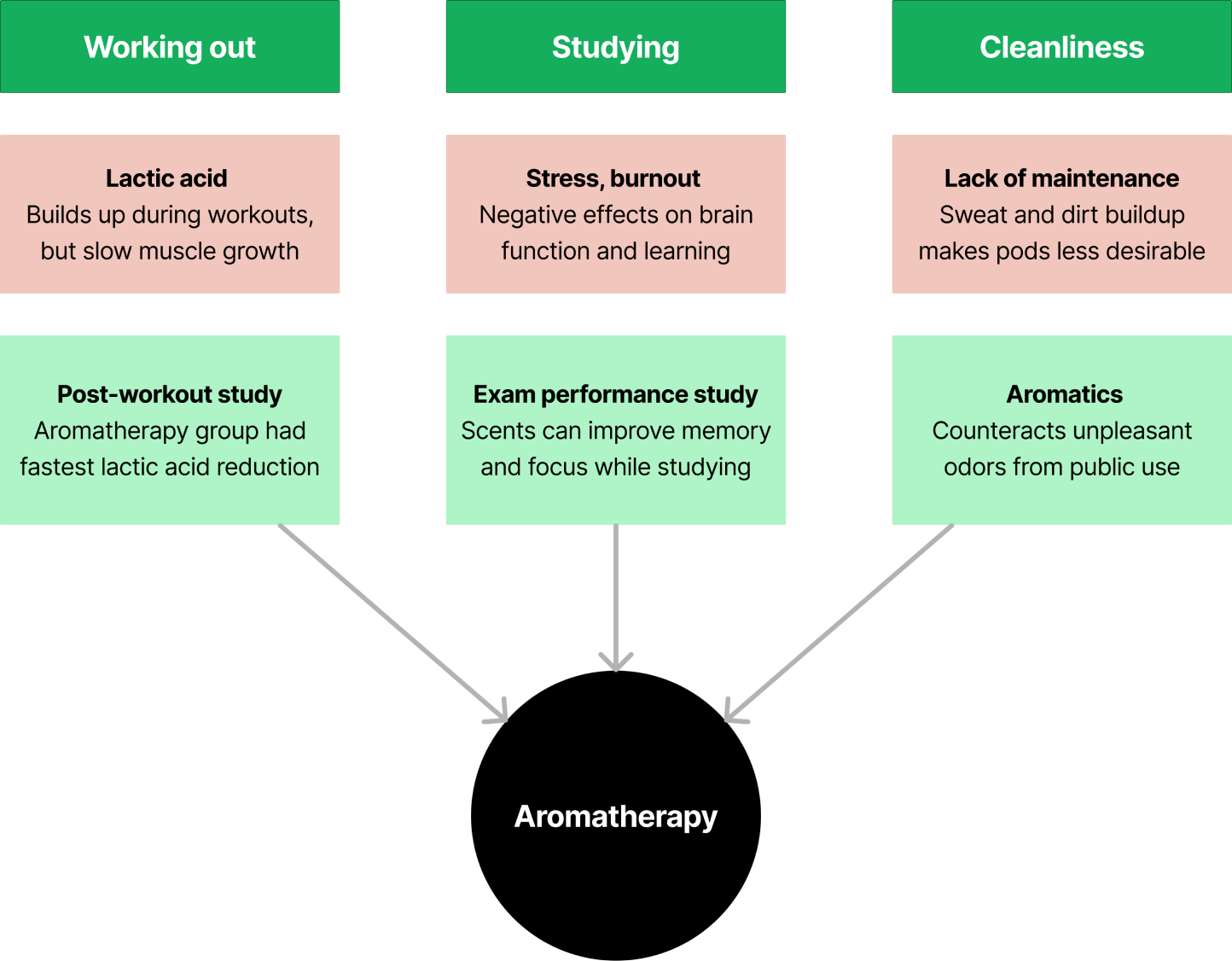
Aromatherapy
There's an intersection between muscle repair, stress relief, and improved memory & attention through scent. In addition, aroma can be used to improve the perception of cleanliness.
Primary Research
We conducted 13 interviews with gym-goers, gym staff, and the general student body to learn more about their respective pain points and what could be done better.
The user interviews were either scheduled over Zoom or done on-site at the gym or at popular study spots. After coding the data, these are the key insights:
of participants pointed to a lack of cleanliness via sight, smell, and/or touch.
“I think there should be a better cleaning system for it because usually when I used to use it, I'd kind of get itchy and in my brain, I'm just like, oh, there's people that used it before.”
of participants mentioned that the sleeping pods were located too far away from where they usually are to use regularly.
“I honestly just forget that they're available to students a lot, it’s really far from all the major areas. I just wouldn't see why I'd walk 20 minutes to the sleeping pod and then take a 5 minute nap.”
of participants cited privacy and awkwardness concerns with sleeping in a public space.
“I've seen people are a little afraid or awkward to go to the nap pods in RIMAC. I just think it's not really a good thing if people are afraid to sleep or feel awkward to sleep in a public space.”
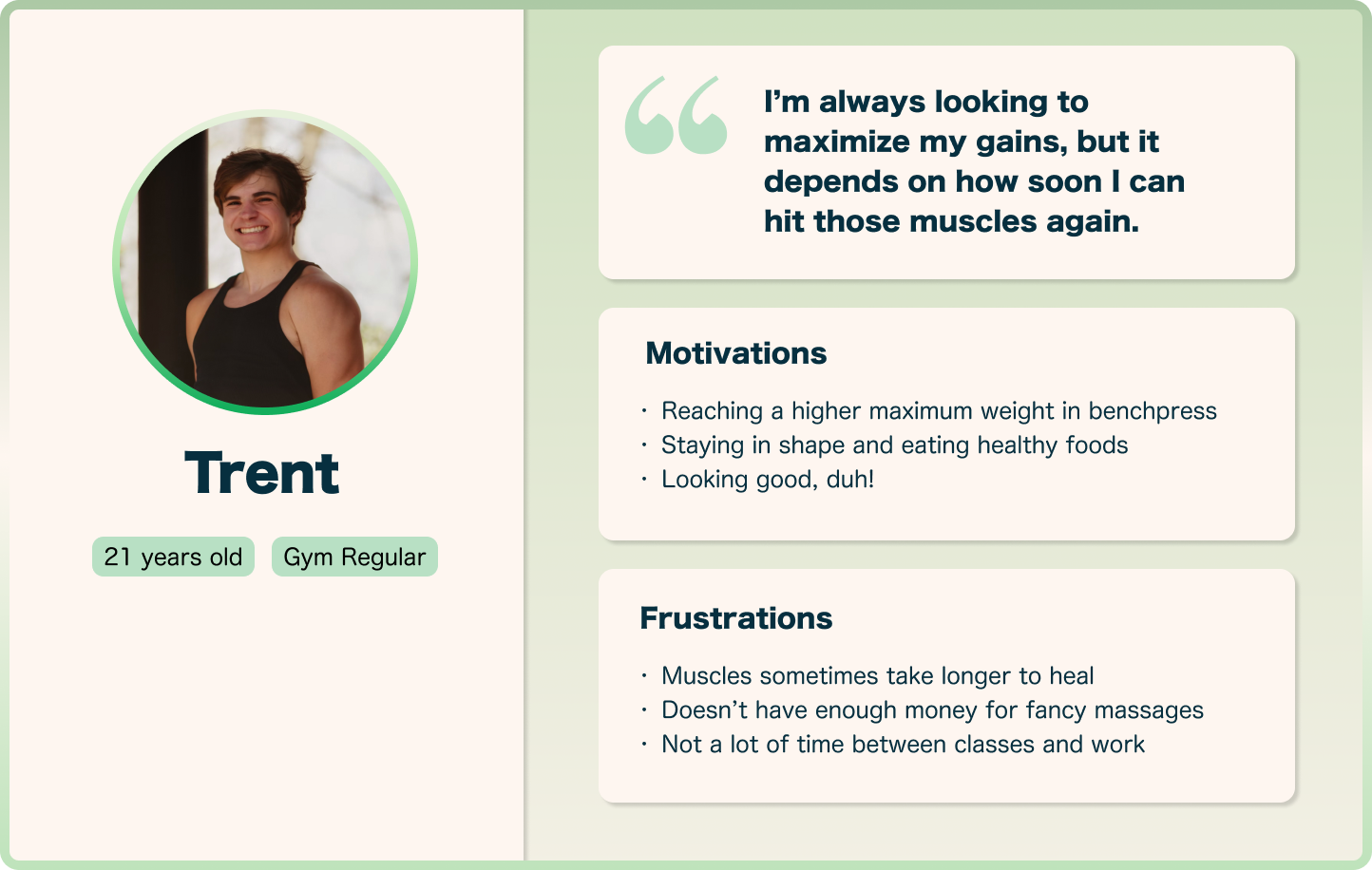
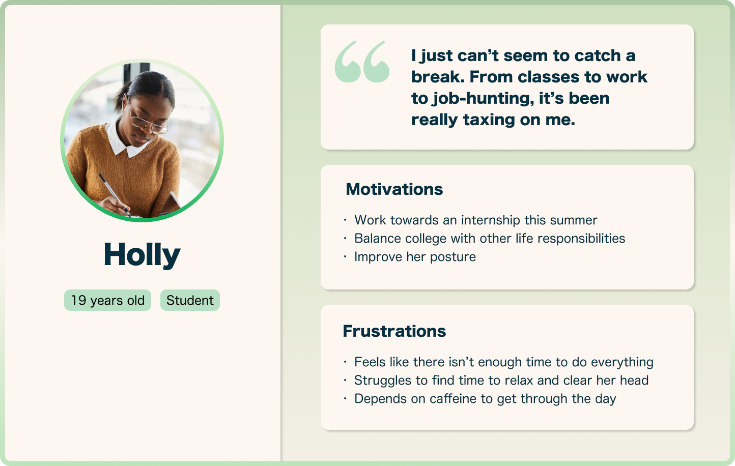
User Personas
Based on the data we've gathered, we created user personas to distill our findings in order to understand the background, goals, and obstacles of both current gym-goers and the general student body.


Design Justification
We initially thought of designing analog controls similar to the MetroNaps™ version, but quickly realized that it would be impractical for two major reasons:
Navigating disparate controls
Some actions couldn't be facilitated, requiring other types of interfaces. Too complicated.
Iteration becomes impractical
Updating the interface with physical materials over and over again costs materials and time.
So how did we rationalize this issue?
As a result, it made more sense to prototype with a tablet interface, allowing quick changes in Figma and centralizing all controls.
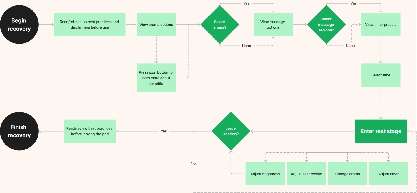
User Flow
Since users would be tired or stressed when using the sleeping pod, ease of use is especially important to create a hassle-free experience.
Paper Prototyping
To test the user flows, I quickly made rough wireframes and UI elements from paper. Then, we conducted preliminary user testing by having participants think-aloud as they walk through the features. Here’s what we discovered:
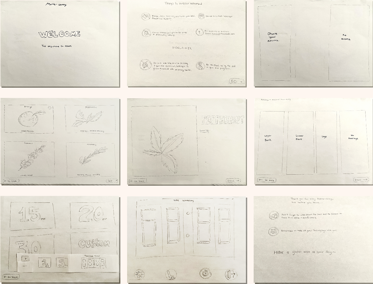
Too many steps
Users felt like the process was too complicated and pointed out how annoying it would be as a returning user, having to go through that process each time.
Unclear signifiers
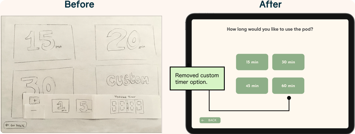
Certain icons and selections were not intuitive, like how some users were confused about how to increase/decrease the timer.
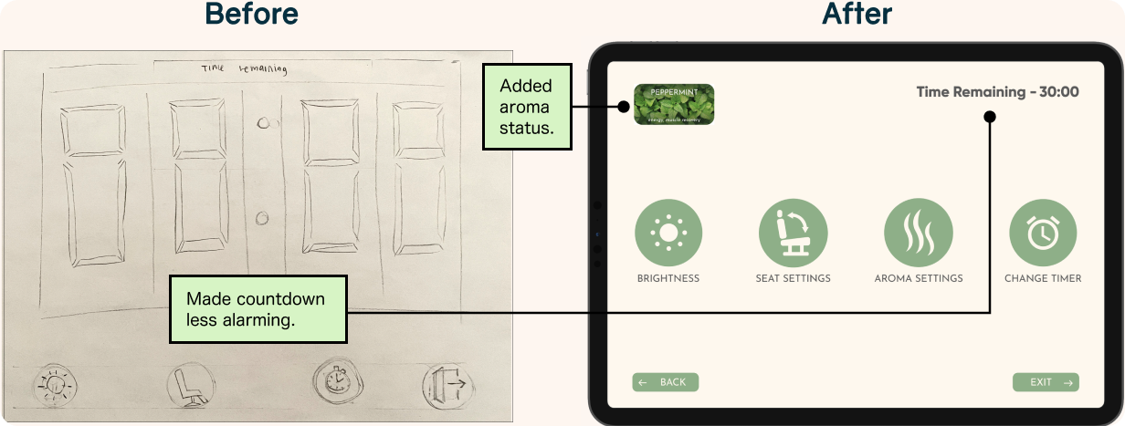
Stressful imagery
The timer counting down should not be so prominent on the resting screen, as the participants associate it with deadlines, exactly what they’re trying to get away from!
Iteration
We first prioritized reducing the total number of actions required to get to the rest stage, resulting in half the amount.
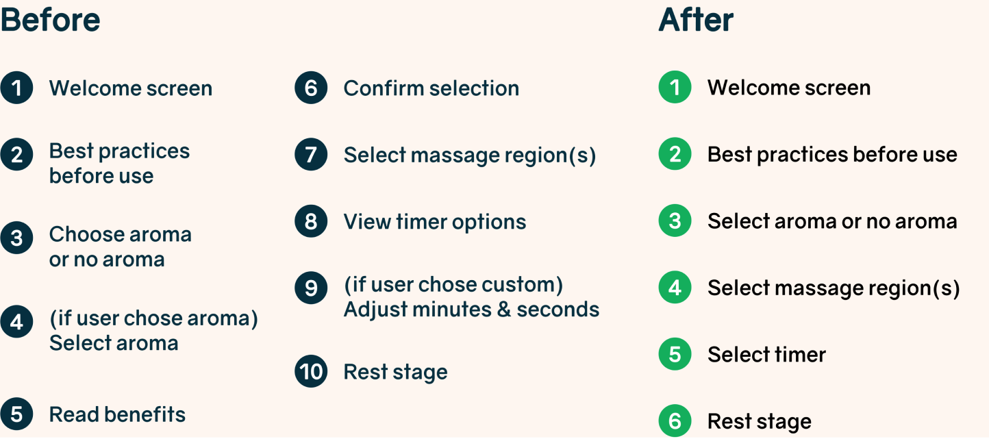
In addition to clarifying the icons, the updated rest screen dials back the visuals to place less emphasis on actions and more on enjoying the rest period.
Offering presets allow users to focus on relaxing sooner rather than making precise choices that could be overwhelming.
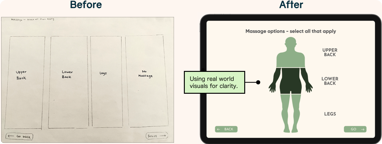
Used more direct visual elements instead of uniform modals to better illustrate the impact on the real -life experience.
Visual Design
Conceptual Rendering
Given the limited resources that are available to us, we cannot easily replicate the sophisticated MetroNaps™ build, so we decided to simulate how the space would feel.
Meanwhile, our new additions to the sleeping pod enhance rest quality and provide a sustainable method of maintaining the space.
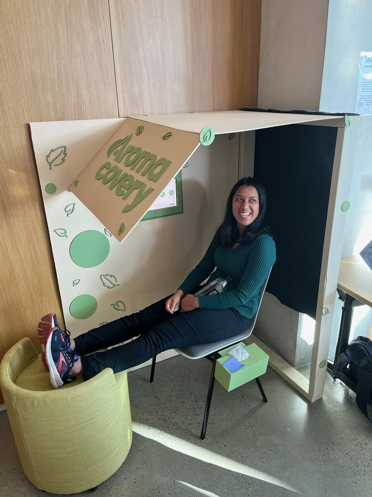
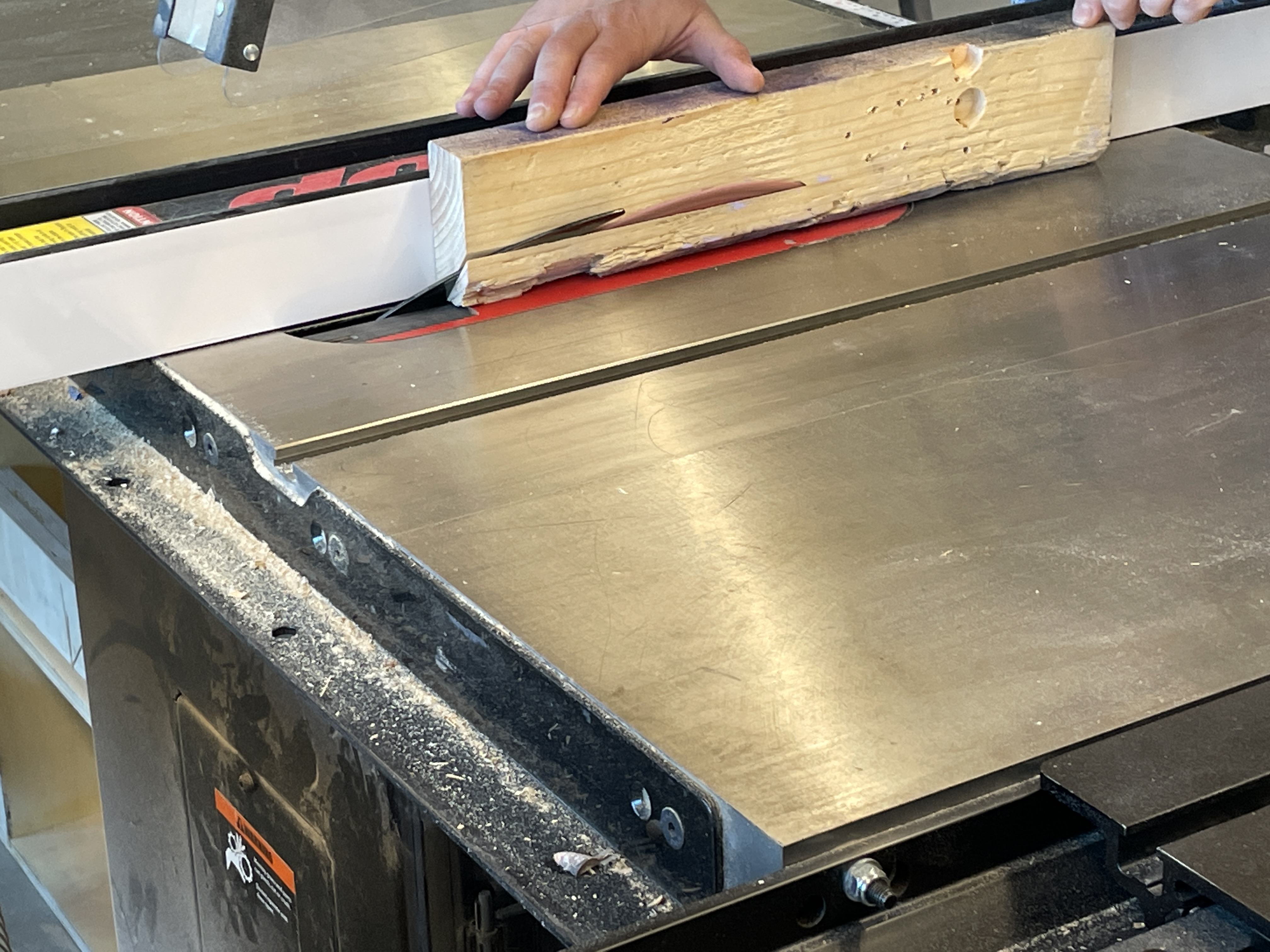
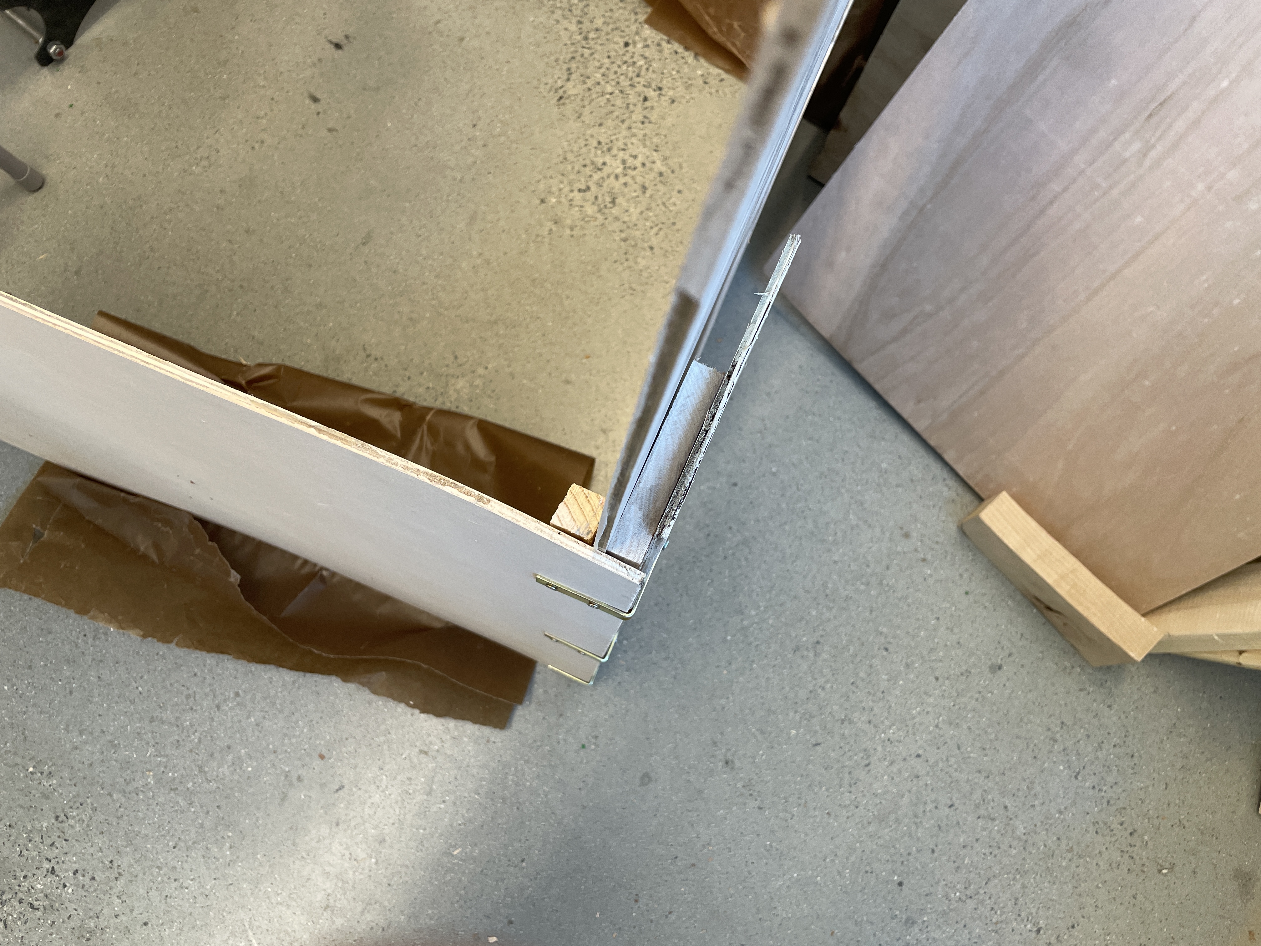
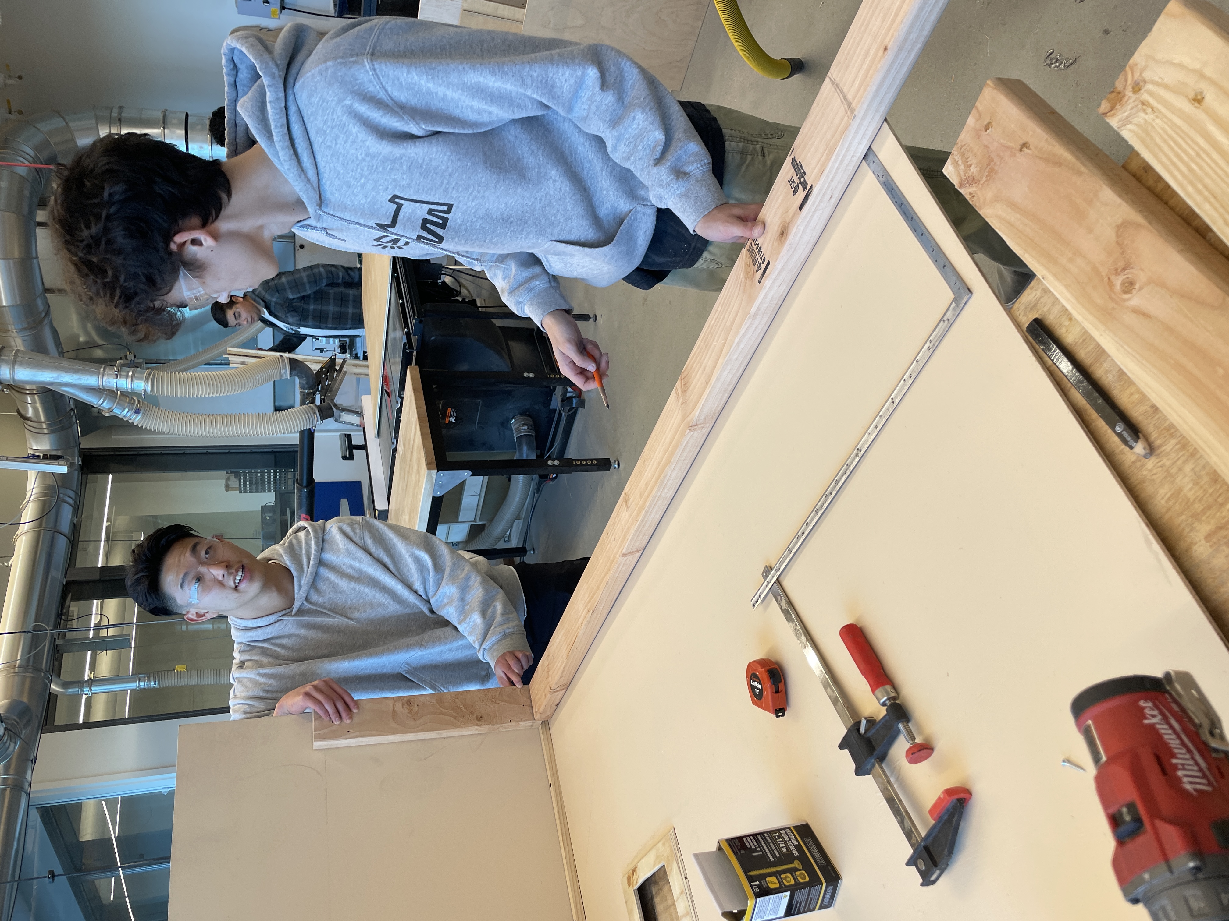
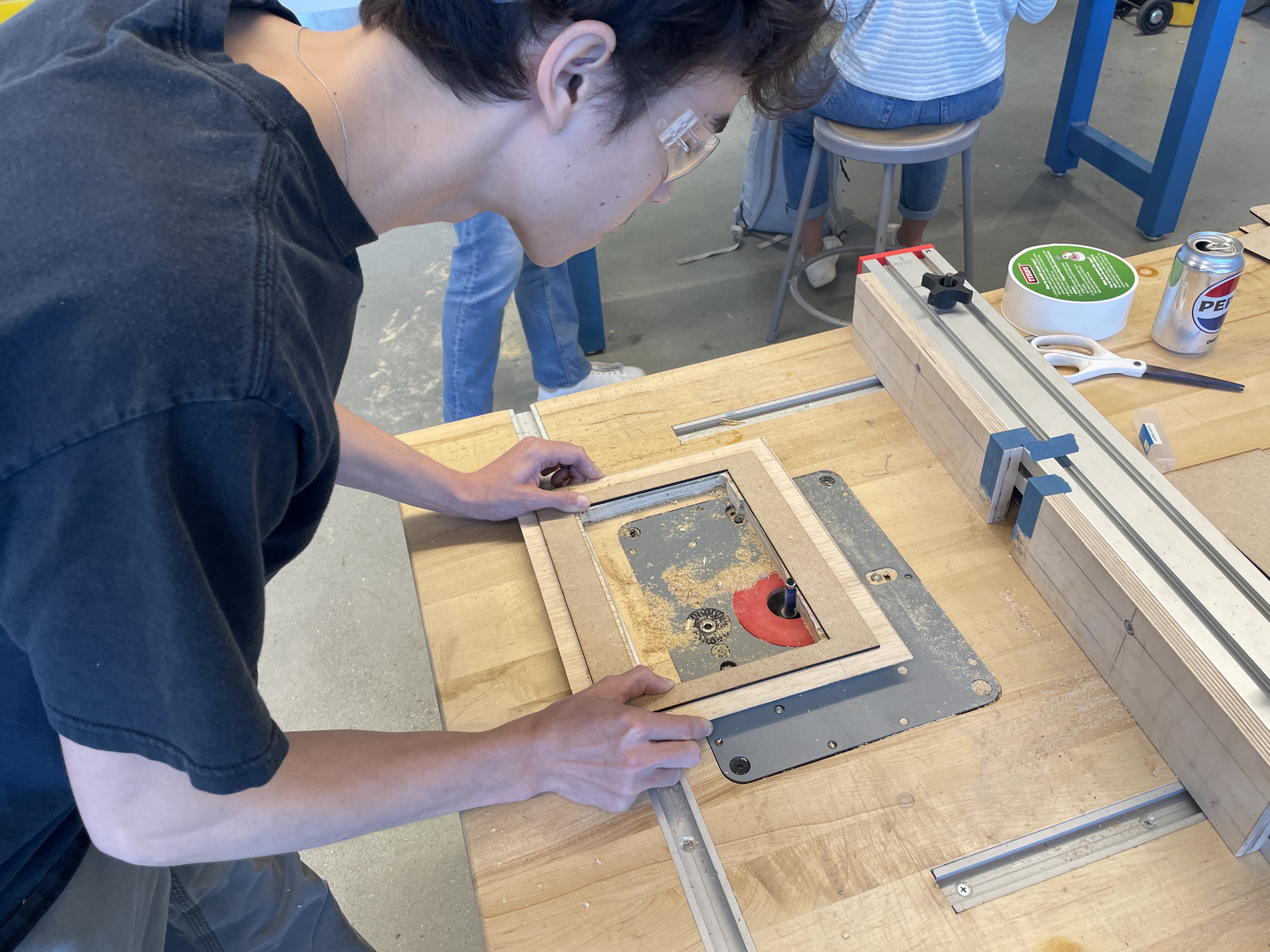
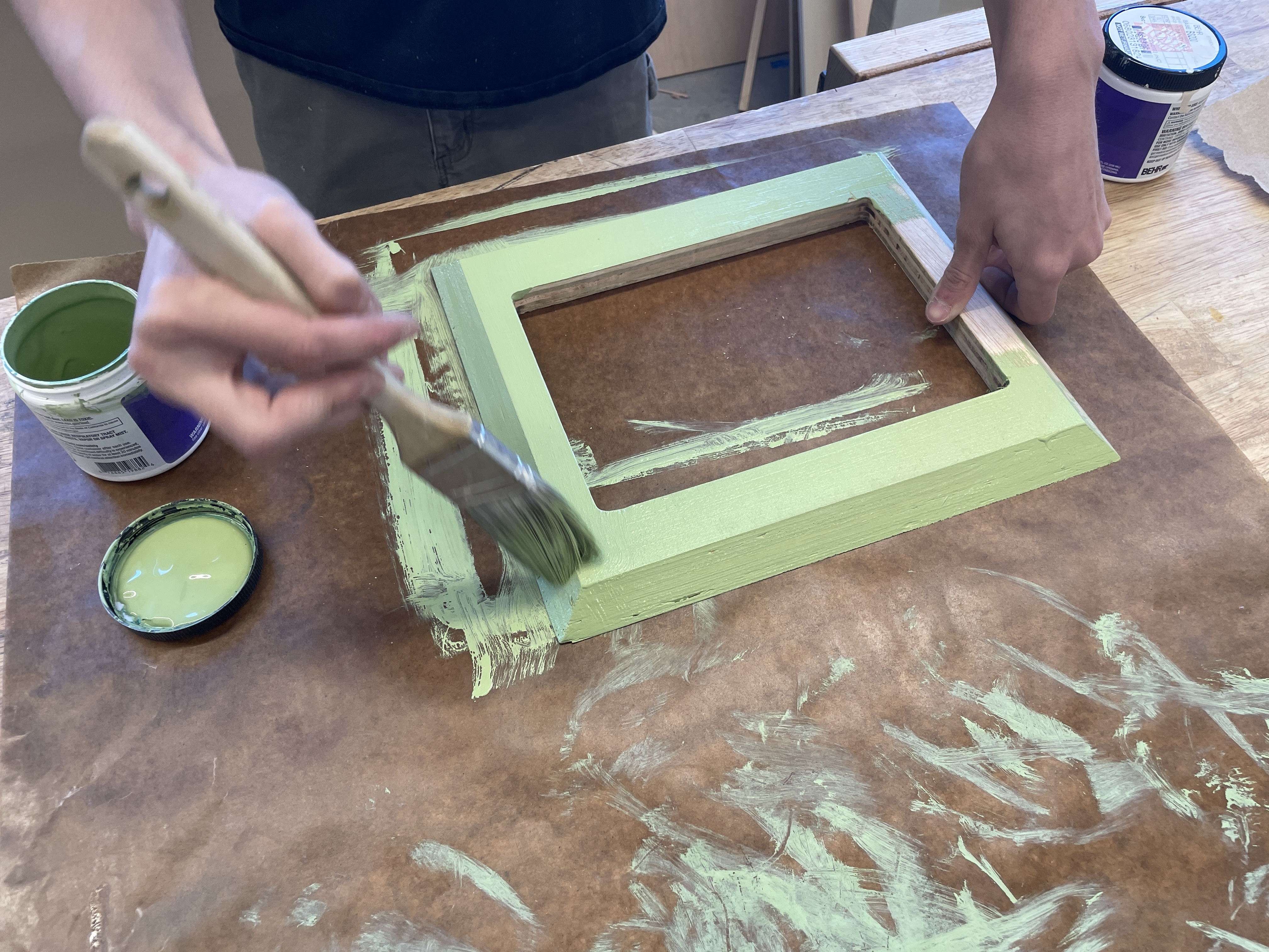
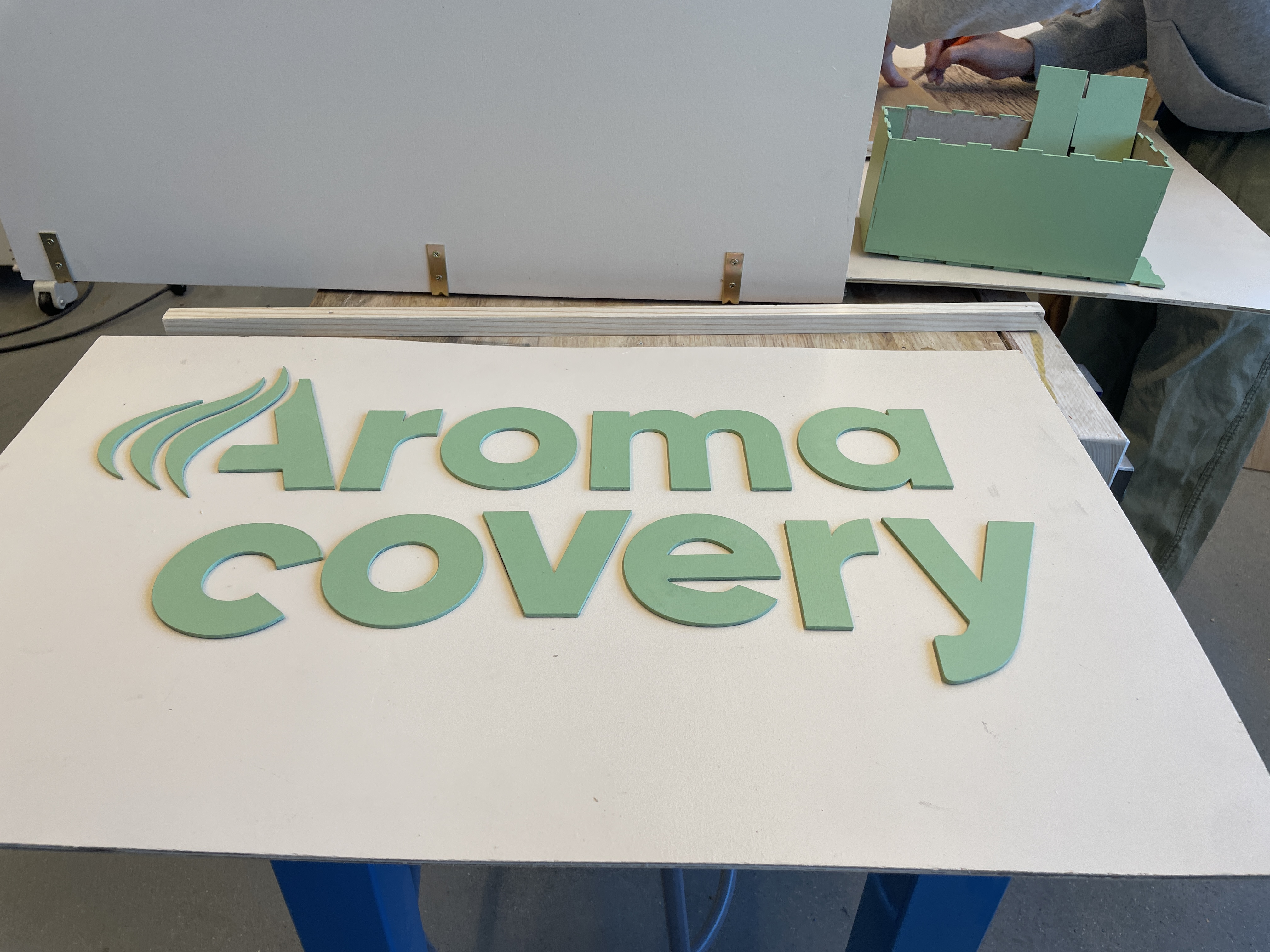
Behind the Build
Here is how we built and decorated the kiosk using the makerspace woodworking tools.
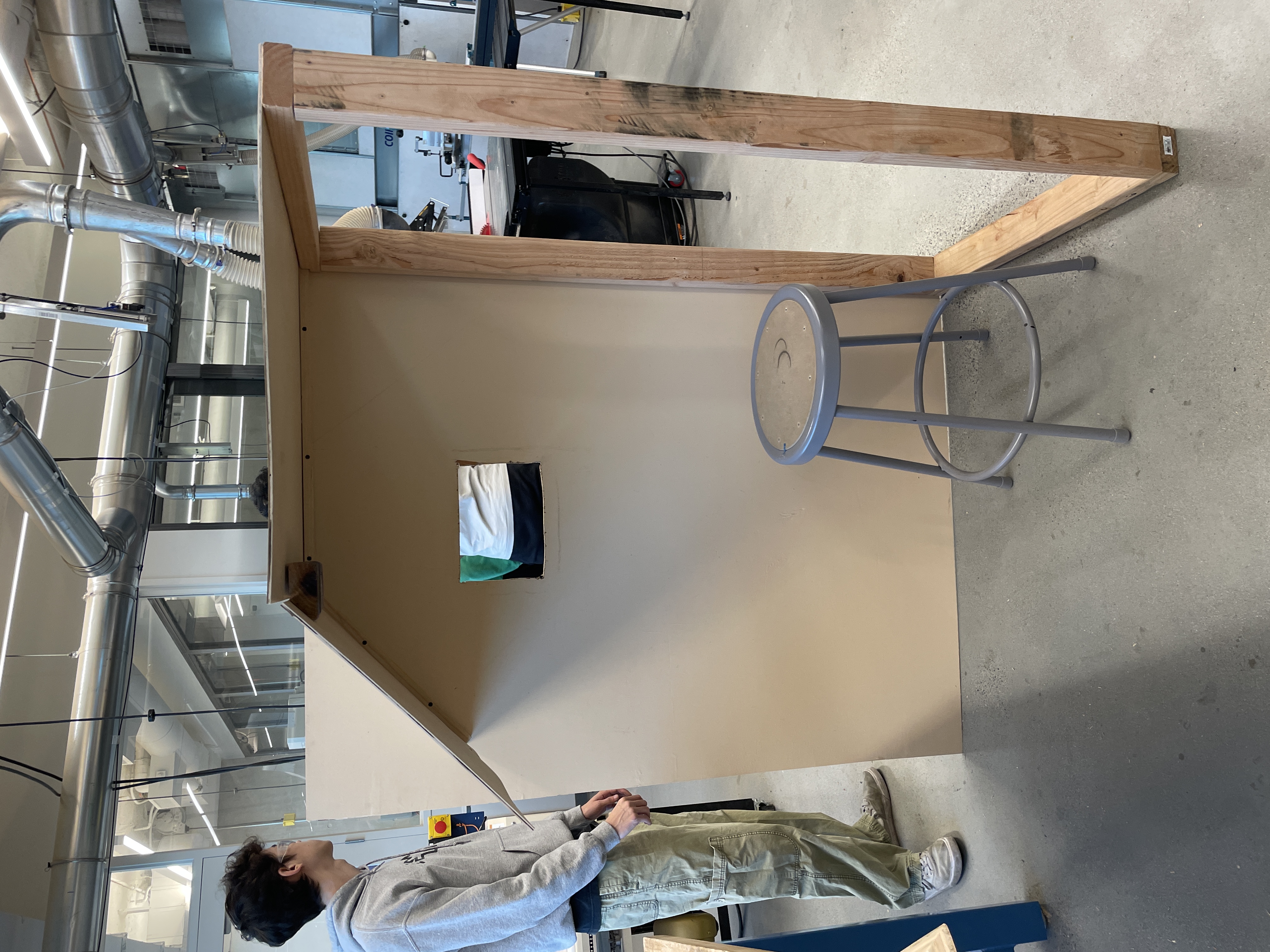
Pictured below is the kiosk showcase, where passersby visited and tried out Aromacovery. We conducted usability testing with several eager participants. This is how people reacted:
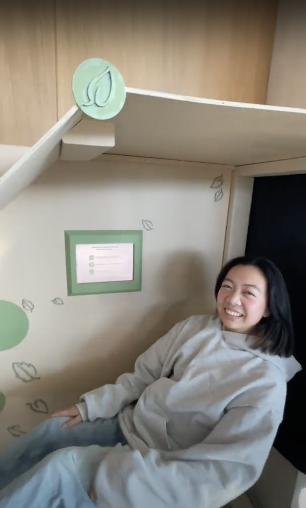
Easy and personalized
“The screens were simple and really easy to understand and there were a lot of settings so that was nice for customization.”
Immersive
“I like that you actually have a diffuser. It’s so cool that I’m actually smelling the scents and experiencing it for real.”
Future Iterations
Improve ergonomics
“I wish the screen could be tilted towards me, it took a couple tries for the screen to know that I tapped the button.”
Enhance the emotional experience
“For the rest stage, I would also suggest doing something more ambient and have it less focused on actions when they should be more subtle.”
It's very clear that these sleeping pods have the power to improve the recovery experience beyond UCSD's campus gym.
More usability testing could be done with Aromacovery to improve user satisfaction and expand its use cases to a wider pool of needs, anywhere someone would need to rejuvenate, restore, and resume.
And what did I learn?
As my first ever UX design project, I never would have expected our end product to surpass expectations and catch the eyes of a seasoned industry PM. In a field of endless what if’s, I wish to research and design with no regrets, not only to push the potential of the product, but also the potential of myself and my peers. We never know what we’re truly capable of until we cross that point.
Pivoting is truly a designer's superpower. Before Aromacovery, we were stuck on several ideas for some time. Thanks to our adaptability and field research, we identified and tackled a relevant problem, gaining a crucial foothold.