dave v

Rehauling SNS Salon & Beauty Supply’s service discovery and booking for salon patrons

My Role

UI/UX Designer

Team

4 UI/UX Designers

Skills

UI/UX Design
Design Systems
User Testing

Timeline

7 weeks
Jan. 2024 - Mar. 2024

01 - Solution

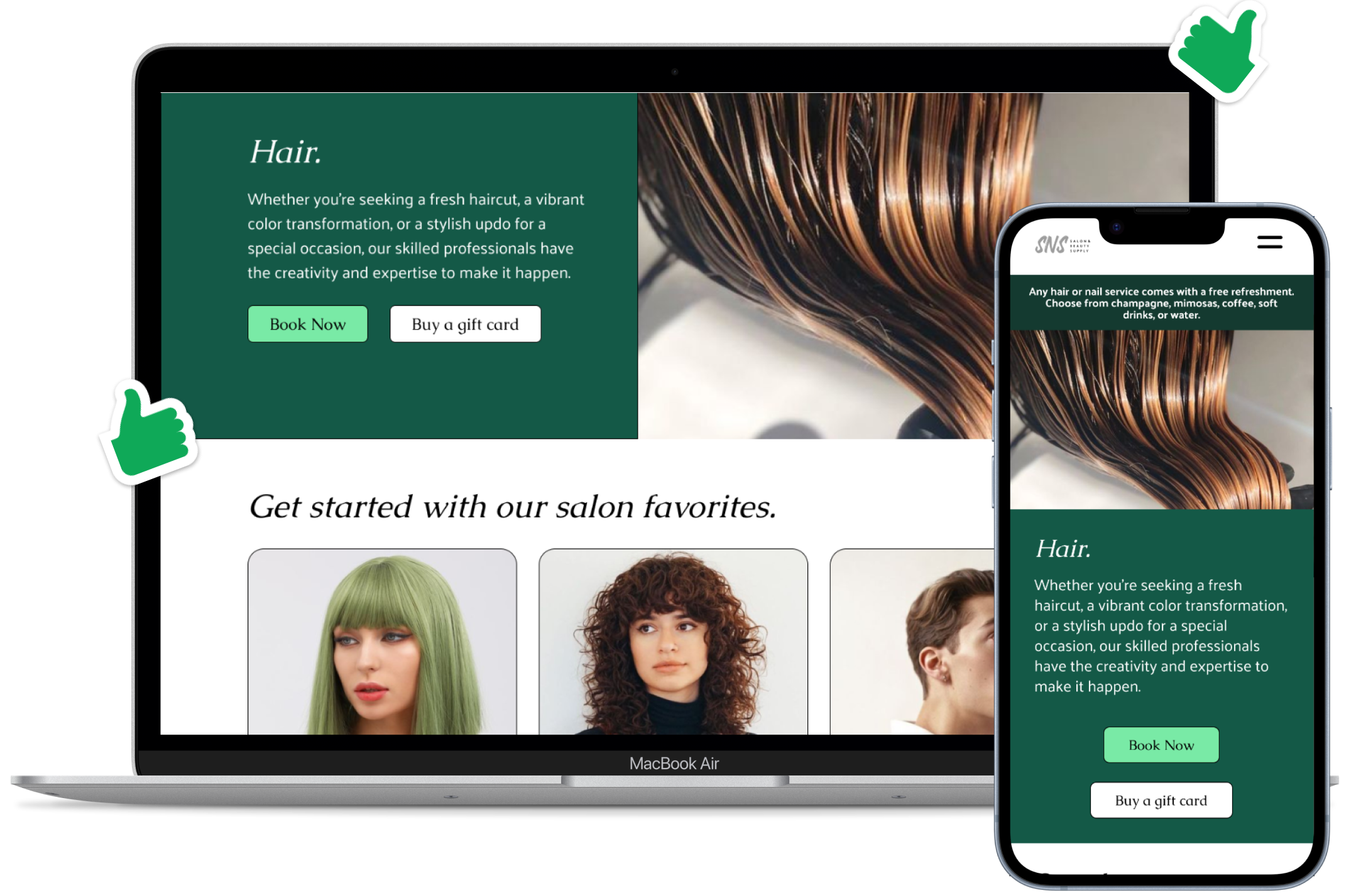
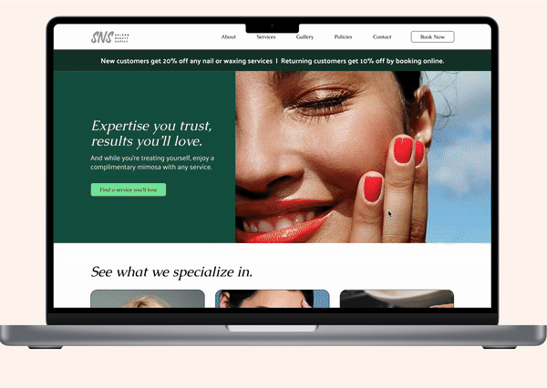
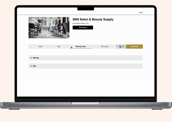
The revamped SNS Salon & Beauty Supply website

I worked with the salon owner to redesign the website with the aim of clarifying the booking experience and better showcasing the quality of services. The work I did helped:

Led an end-to-end redesign across two core user journeys.

Reduced booking complexity by 55.6% + service discovery down to 2-3 scans avg.

Web-responsive

The redesigned SNS Salon & Beauty Supply website is built for both desktop and mobile screens.

The redesigned SNS Salon & Beauty Supply website is built for both desktop and mobile screens.

Everything you need to know for your SNS Salon visit

With a fresh look and feel, users can better resonate with the salon's story and easily find key information about the offered services.

A looping video of the main site.

Enjoy a streamlined booking experience

Say goodbye to a cluttered booking page, and say hello to smooth booking and exciting experiences to come.

A looping video of the booking flow.
02 - Background

What our client wants to achieve through a redesign

The goal of this project was to redesign SNS Salon’s website to better support discovery, trust, and booking for new customers. While the salon relied strongly on word-of-mouth, the website needed to play a more active role in helping users evaluate quality and feel confident booking online.


Goals

Strengthen first impressions

The site needed to communicate the salon’s quality at a glance, using real salon work and clear storytelling to build immediate trust.

Make services easy to evaluate and book

The site needed to help users quickly understand, compare, and choose services so booking online felt as confident as booking over the phone.

Turn the website into a primary trust signal

The site needed to establish credibility on its own through visual proof, clarity, and transparency, rather than relying on Yelp or referrals to do that work.

03 - Discovery

Auditing the original website

After taking a closer look at their current website, we found that visual clutter and usability issues hindered the website's ability to communicate the salon brand and core specialties.


Problem

The need for visual storytelling

From the first impression, the landing page promotes deals before communicating the salon’s value to the viewer. Images of past work only makes an appearance at the bottom of the page.

Usability issues make navigation hard

The readability suffers because the services are images instead of inline elements, especially across different screen sizes. Too many drop-downs and variants overwhelms the users and makes it hard to distinguish between items.

User Interviews

Talking with salon-goers to polish our perspective

The client’s perspective on loyalty set an initial direction, but conversations with salon-goers clarified how customers evaluate a salon when deciding to book.

Trust must be shown, not told

Customers expected to see real examples of hair and nail work easily. Several users said they would not book without browsing images, even if they trusted recommends.

Booking was complex and uncertain

The number of dropdowns and unclear service distinctions made users hesitant, especially on mobile. Even loyal customers avoided booking through the site.

Users weren’t sold on the salon yet

Customers also relied on online reviews to vet the salon’s quality—suggesting the website wasn’t doing enough to establish credibility.

04 - Design

Prioritizing for customer conversion

Due to limited access to internal data, we prioritized qualitative signals and scoped the work to two critical user journeys. Secondary features were explored, but deprioritized to focus on clarity and confidence in the core flows.

Prioritized

Salon service exploration

Focusing on a stronger first impression on potential patrons.

Booking an appointment

Reworking how services are presented to prevent drop-off is crucial.


Not prioritized

Live availability tracker

Stylists’ schedules can vary, would be tedious to manually update continuously.

Easier way to cancel/reschedule

Most issues users dealt with came before making an appointment.

Homepage

Streamlined hero, stronger impression


The updated homepage.

The hero was redesigned to build trust before asking users to book. Instead of promotions dominating the page, they were moved to a navigation ribbon, freeing the main space to showcase real salon work and guide users toward services and staff profiles so they could explore before committing.

Show 'About' & 'Policies' pages.
The updated About and Policies pages.

While smaller additions to the redesign, salon-goers shared that knowing whether a stylist was right for them and how to manage appointments was key to booking with confidence. These pages reduced uncertainty around fit and expectations without relying on external reviews or word-of-mouth.

Services

A catalog made for easy vetting and decision-making


The updated services page. The updated gallery users can click into if users scroll to the bottom of the services page.

Iteration

Structuring for faster discovery


The iterations from first draft to final services page.

Early versions tried to make each service clearer by adding more detail, but testing showed this made the page feel dense and long to navigate. The final design grouped services into color-blocked categories so users could locate specific services in 2-3 scans instead of searching the full list, while curated salon suggestions preserved visual context without overextending scroll duration.

Booking

Reduced booking search complexity by 55.6%


The updated booking page.

The booking flow was simplified by consolidating overlapping options (184 → 82) and standardizing service cards. This reduced visual noise, made differences between services easier to understand, and created a more guided path booking that users were less likely to drop off. Add-to-cart and Add-on features supported exploration without forcing them into early decisions.

Constraints

Working within a 3rd party design system

Because booking runs through Vagaro, we proposed changes that can realistically be implemented within that platform. Most of our components were built referencing existing Vagaro specs and official docs, which kept the designs realistic while still making the experience clearer and easier to navigate.


The before booking components.
Hair and nail services are scattered and not intuitive to search. Variants leave customers confused on what the service is and how it factors into prices.
The after booking components - dropdowns and tab reorganization.
The dropdowns already exist, let's just consolidate them and create more tabs to organize them into (no more page bloat).
The after booking components for Add to Cart.
"Add to Cart" feature helps users explore catalog without being locked into a purchase early on.
The after booking components for service cards.
In addition to standardizing service cards, the "Add-ons" feature combines similar services together and provides users more clarity on what the service is.

Joint Design Systems

The SNS design system. The Vagaro design system.
07 - Reflection

And that's a wrap!

Impact


Goal: Strengthen first impressions

Reclaimed ~70% of above-the-fold space to showcase real client work, shifting from promoting deals to setting clearer expectations for the salon experience with visual proof of quality.

Goal: Make services easy to evaluate and book

Reduced booking complexity by 55.6% and avg. scans down to 2-3, turning an overwhelming search process into a guided, scannable flow.

Goal: Turn the website into a primary trust signal

Helped users validate the salon directly through the site by adding staff specialties, structured services, and gallery previews, reducing reliance on Yelp or word-of-mouth to feel confident booking.


What I would have done differently

Defining success earlier

I would formalize success metrics earlier on. While we aligned on big-picture goals, having clearer signals for a working solution would have better helped us evaluate tradeoffs and measure changes.

If I had more time

Explore my client’s assumptions further

Salon patronship took on different meanings across customers and business owners. Digging further into these gaps could've helped us better align our stakeholders’ goals, or potentially explore more tailored solutions for each need.

Learning

Owning the design despite uncertainty

I gained confidence in making decisions without perfect information. I learned how to define constraints, prioritize what mattered most, and move the project forward without taking on too much all at once.